Tatiana Ayazo Velez

Brand Design + Art Direction

← Back
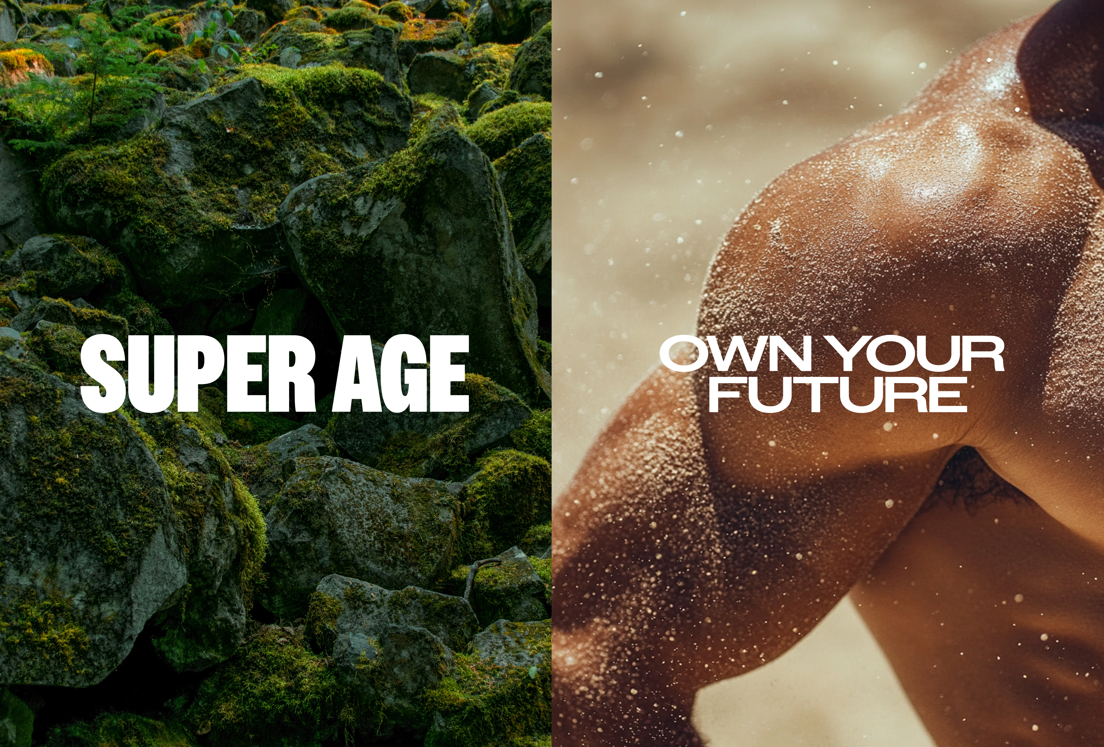
Super Age hero — Super Age / Own Your Future

Wellness & Longevity Brand

Client work via Pardon.
Super Age

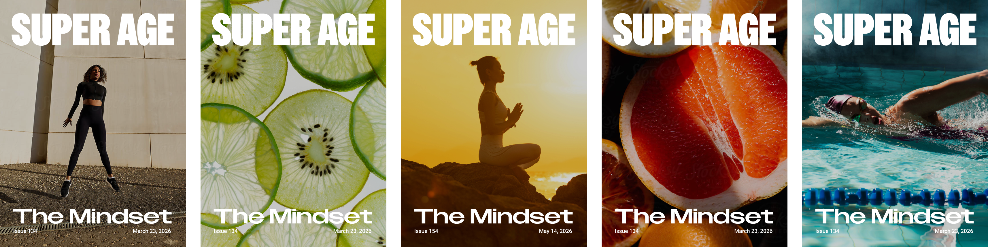
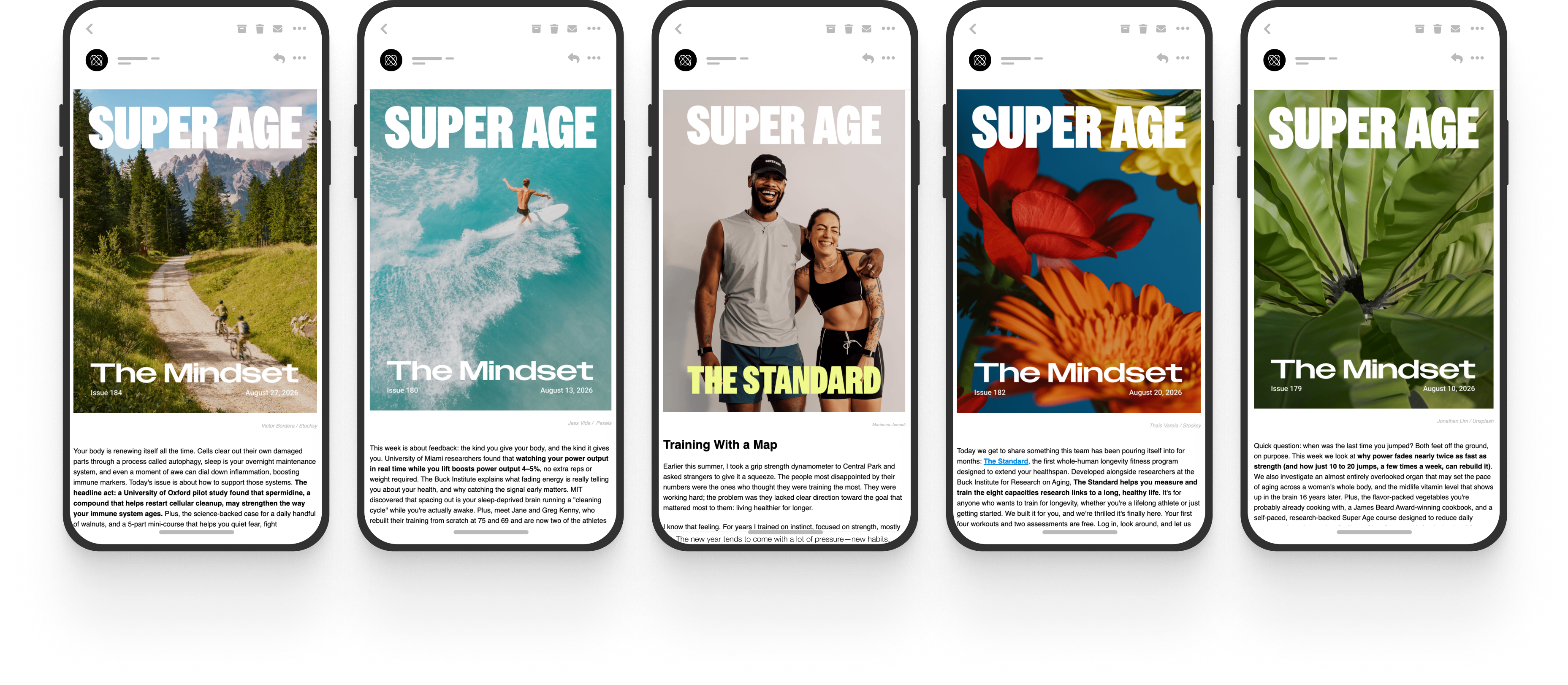
Super Age's publication, "The Mindset," redefines aging as a transformative journey, celebrating the wisdom, strength, and vitality of aging.

We envisioned a world where aging is celebrated as a journey of renewal and vitality. Through Super Age, we sought to reimagine the narrative around aging, drawing inspiration from Earth's timeless wisdom and resilience. We developed a brand identity and launched "The Mindset" publication to inspire and empower individuals on their journey through life's natural stages.

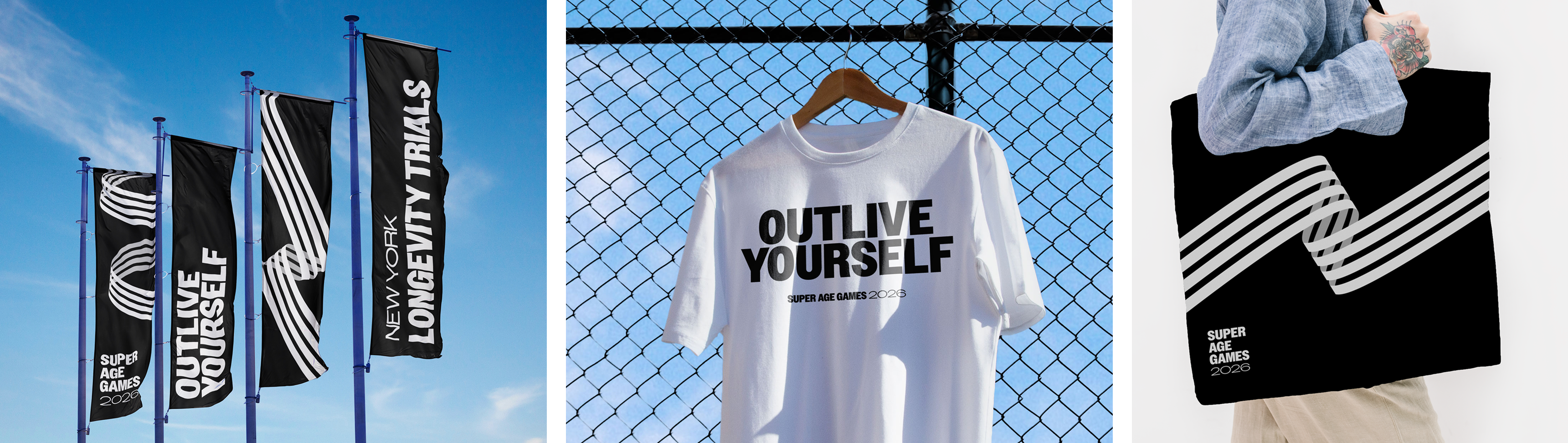
Since launch, Super Age has grown to 1M+ newsletter subscribers in under a year, with a 54% open rate — well above industry benchmarks — and a 9.8% CTOR. The brand has expanded from a digital publication into in-person experiences, including longevity-focused Immersions, live conversations with the Super Age Scientific Advisory Board, and the Super Age Games, the first in-person longevity competition of its kind.

Role
Design Lead

Deliverables
Concepting
Brand Development
Brand Strategy

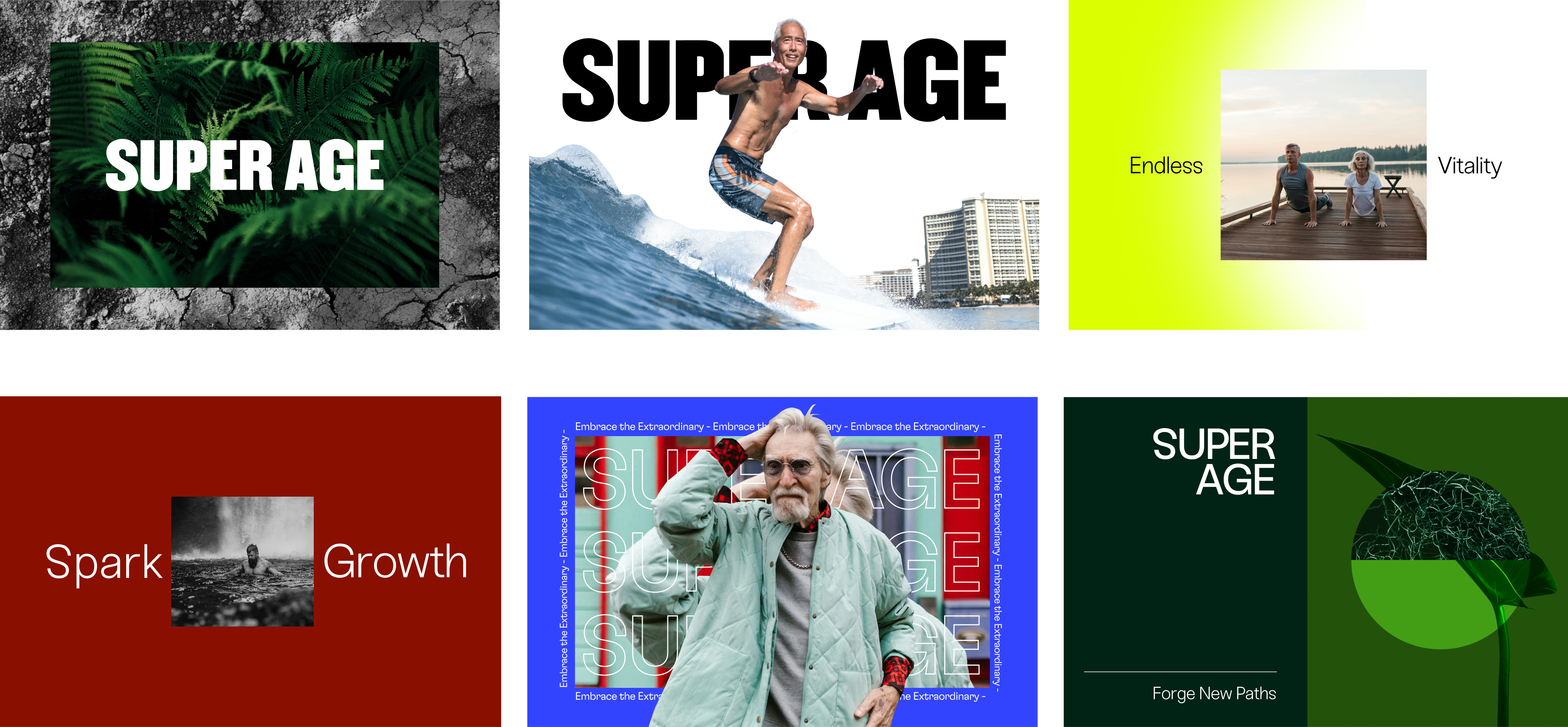
Initial concepts for the brand

Initial mockup concepts for the Super Age brand

Initial type personalities

Super Age typeface treatment row
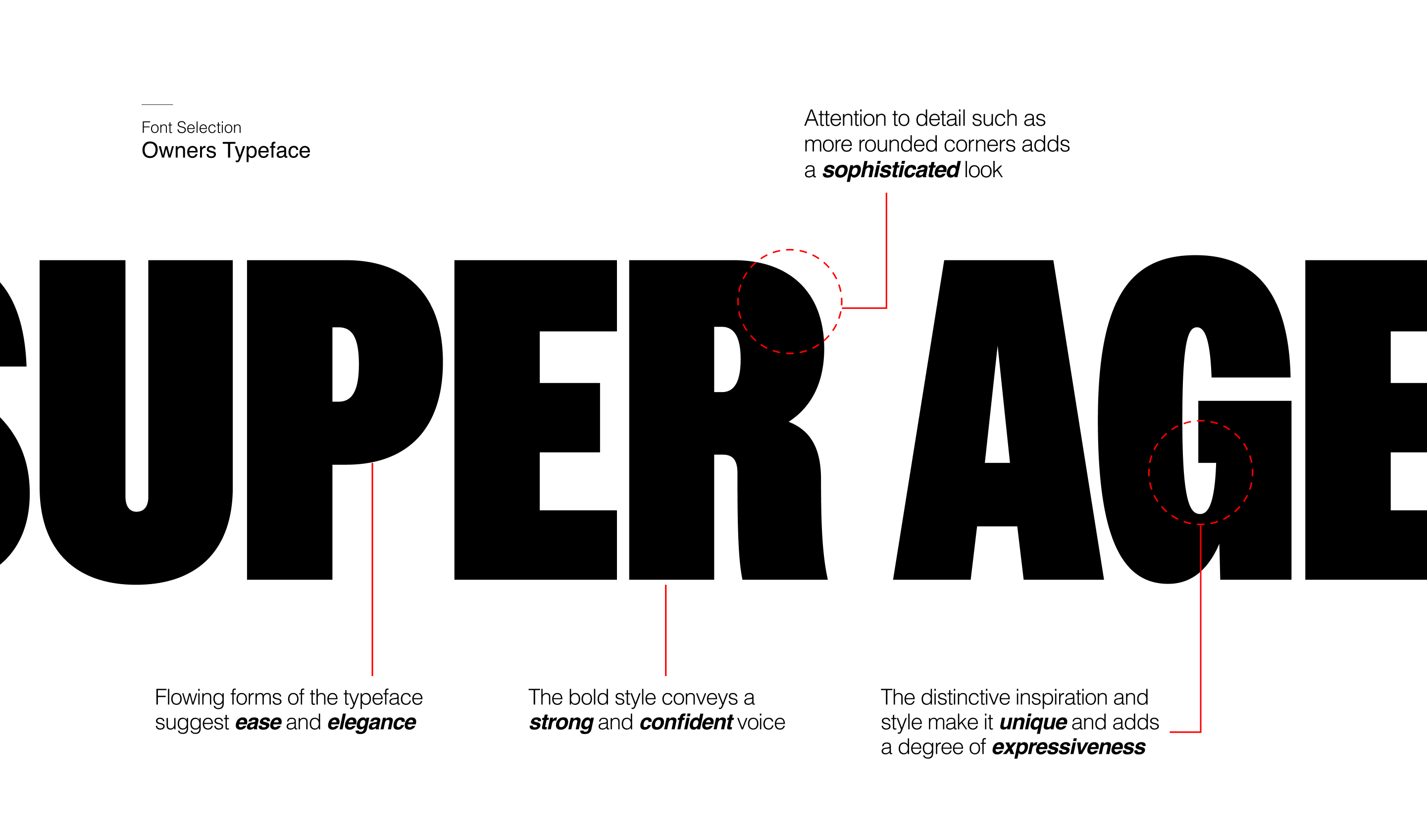
Font Selection — Owners Typeface annotation
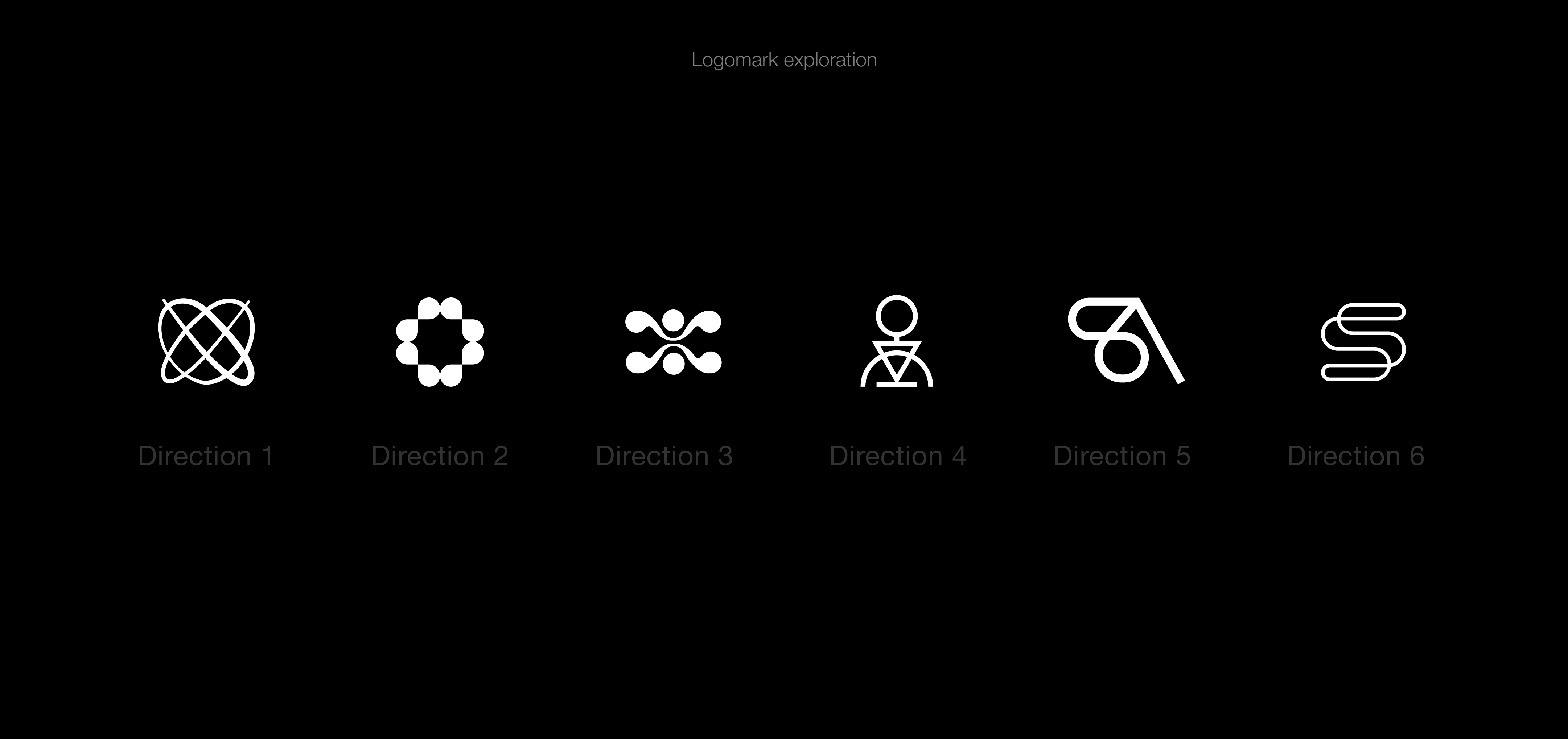
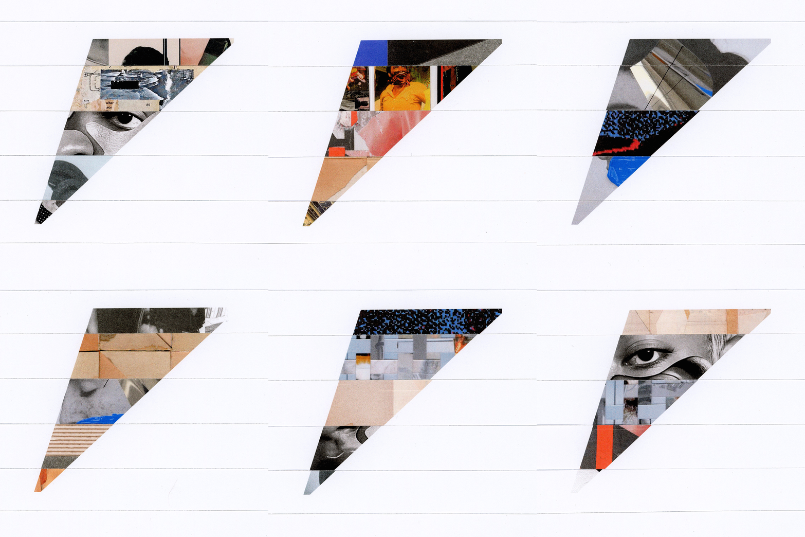
Logomark exploration — six directions
Final Super Age logomark selection

Logomark

This symbol captures this timeless rhythm, reminding us that each moment is part of a much larger cycle. "Super Age" is one of these fleeting yet transformative phases — a stage of life where renewal, growth, and vitality intersect. Just like the Lissajous curve, we are shaped by time's flow, always in motion, always part of the greater ceaseless journey of life.

Super Age brand application postcards

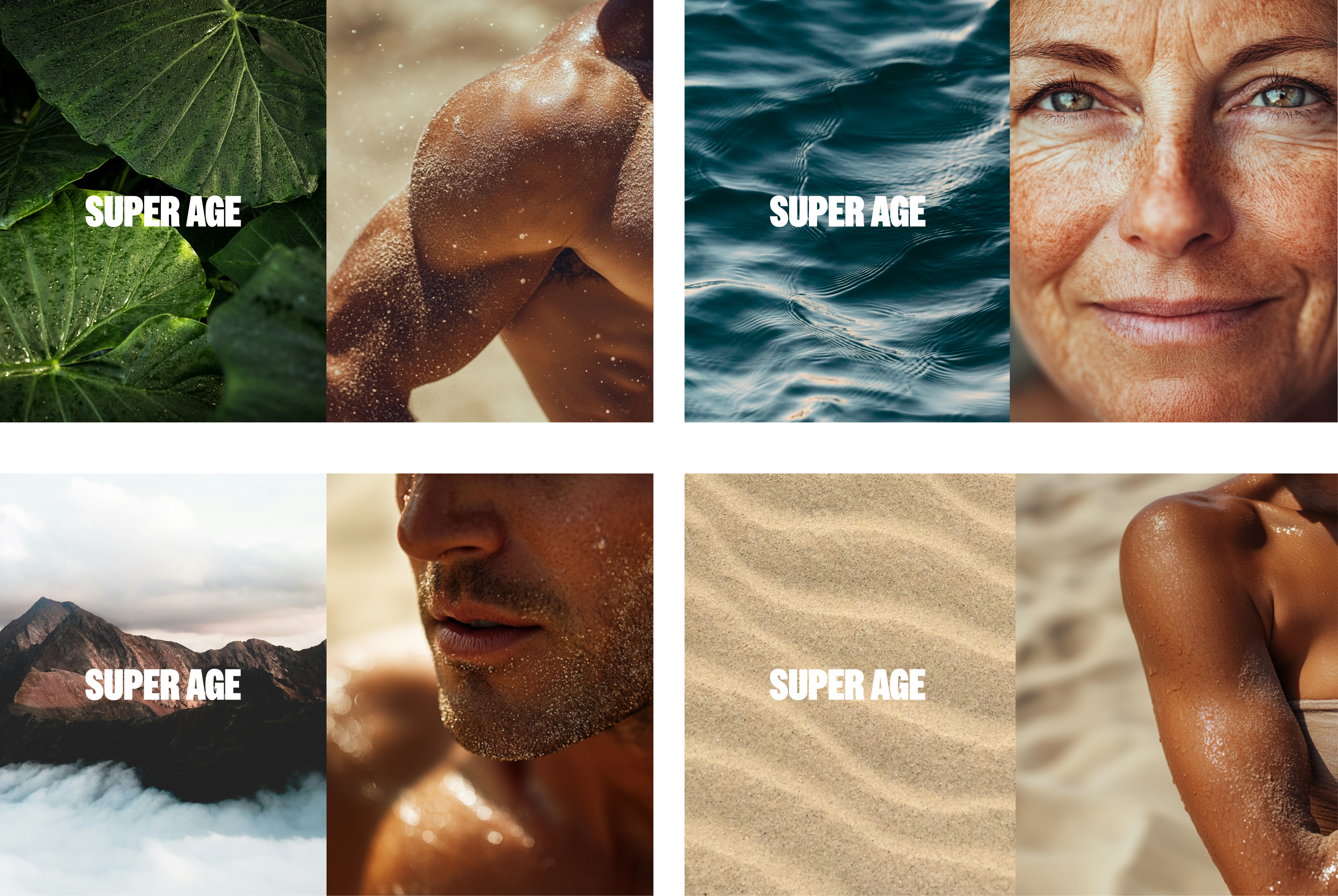
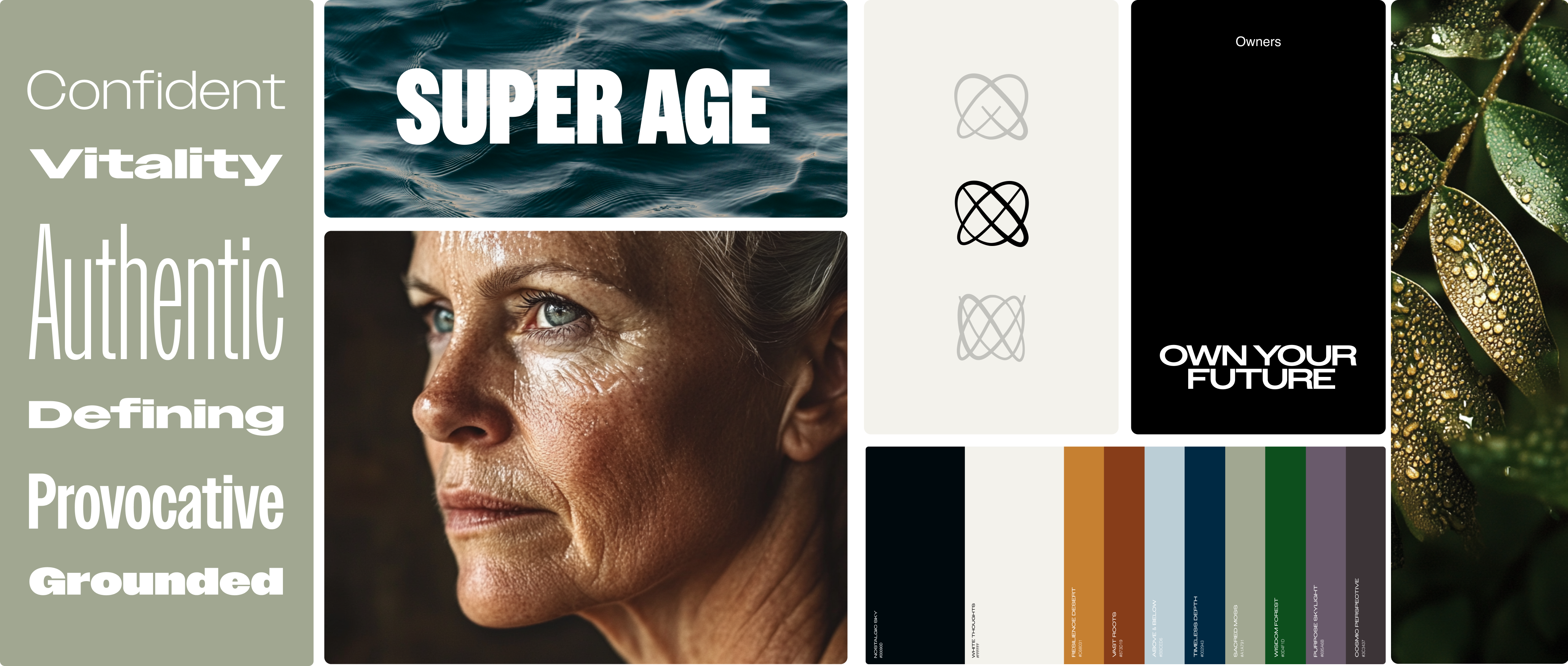
The color and photography of the brand embraces the deep relationship between humans and nature, drawing inspiration from four natural ecosystems: forests, peaks, deserts, and reefs.

Brand vibe — mood photography, logomark, and color palette

Brand vibe

Website Expression

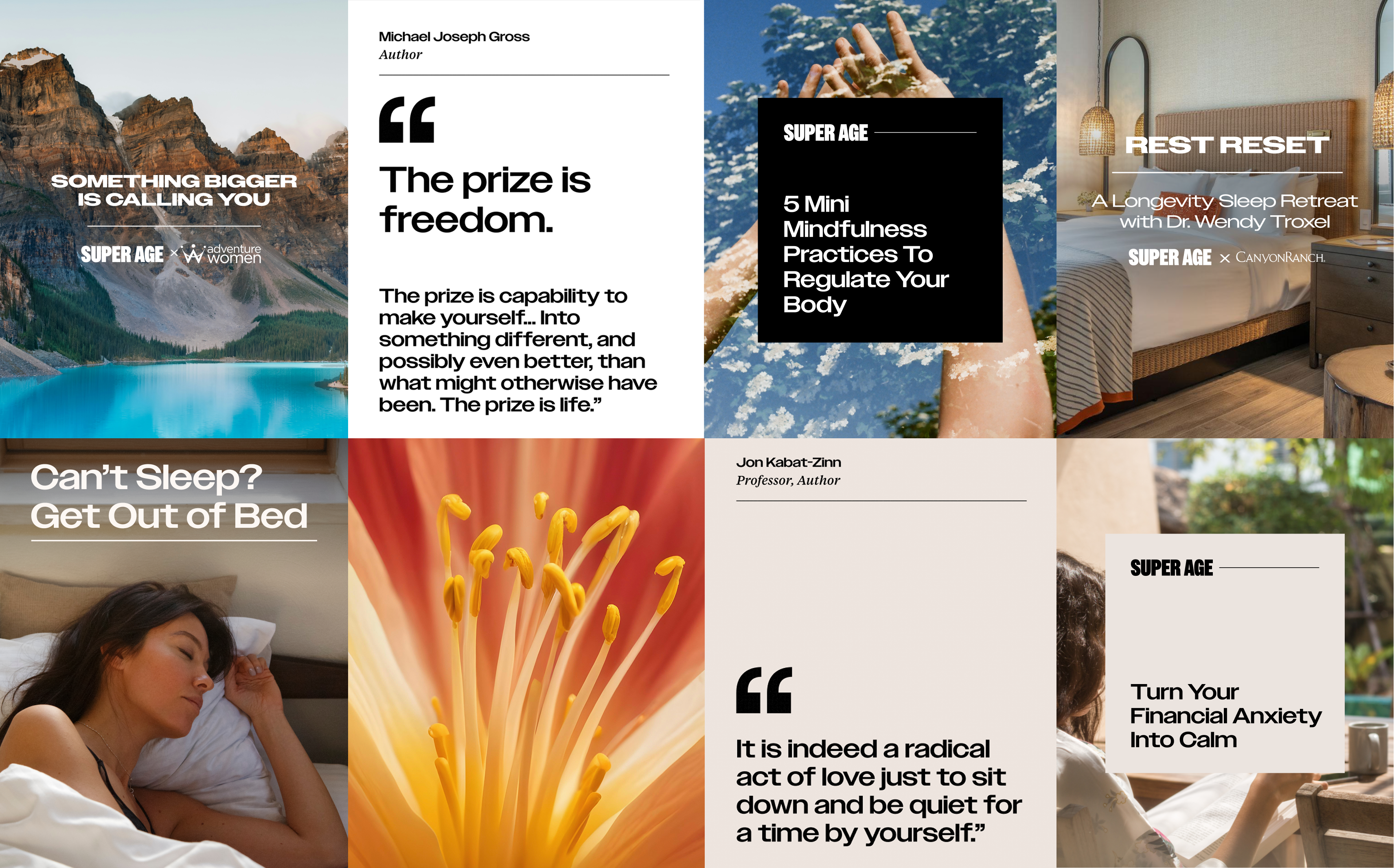
Super Age Instagram grid — quote cards and lifestyle photography

Instagram Posts

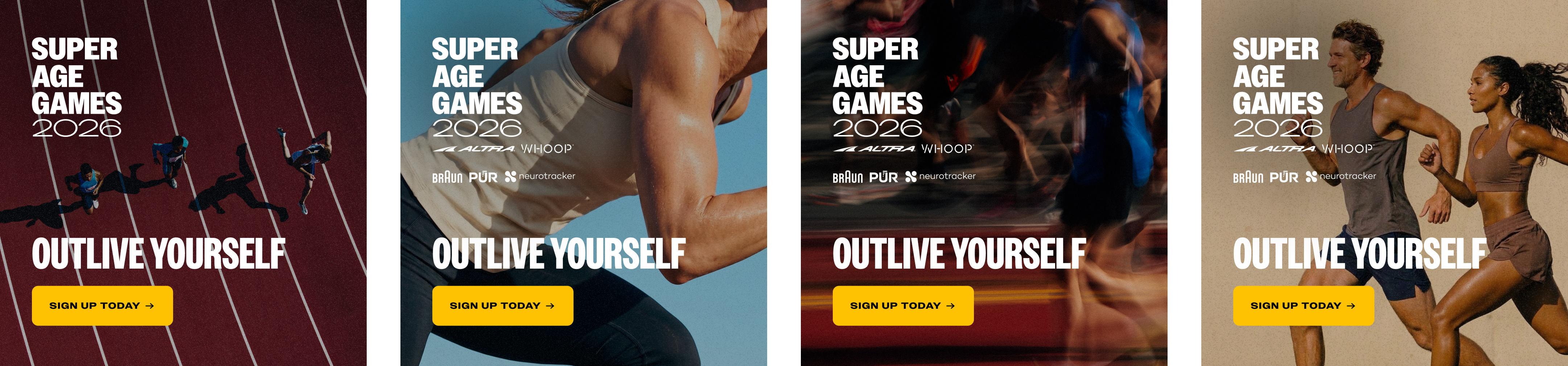
Super Age Games 2026 ad creative

Ads for the Super Age Games

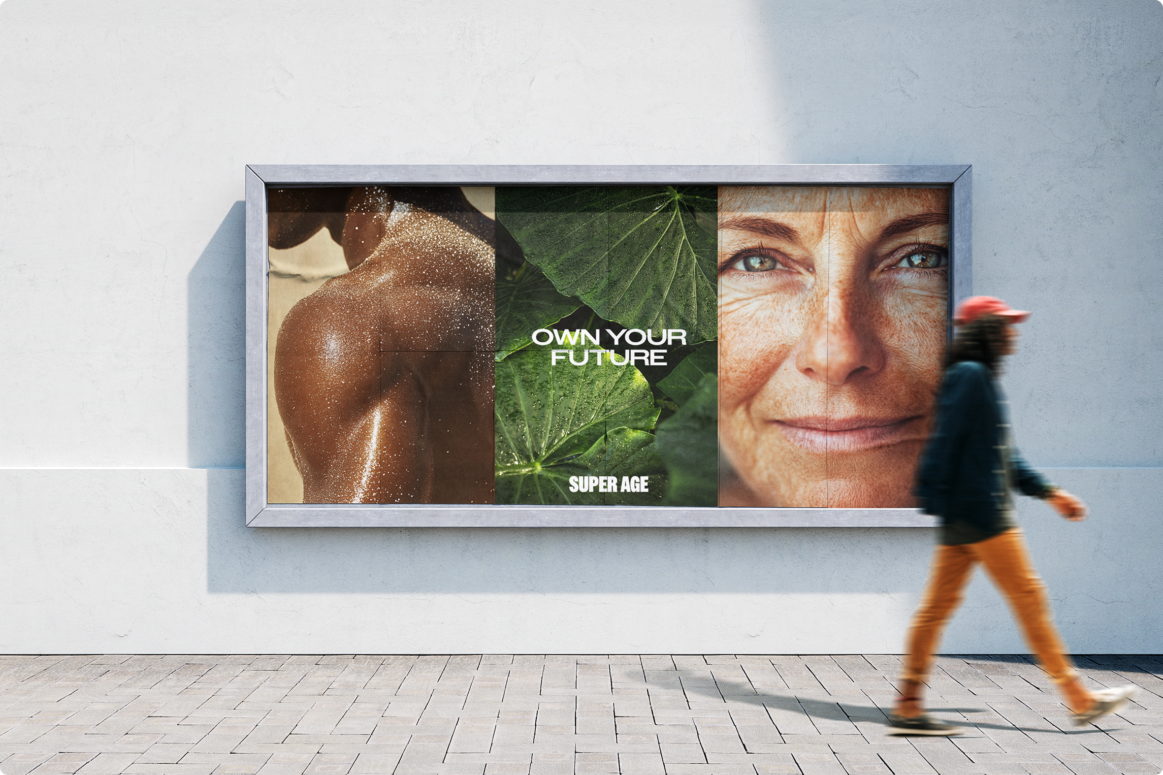
Super Age billboard mockup
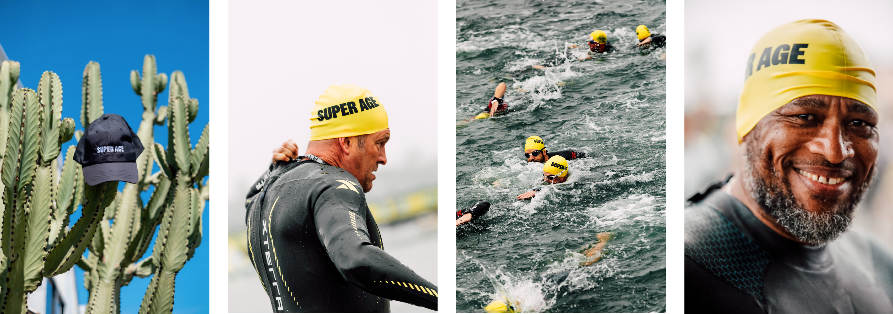
Super Age Cal Tri 2025 event photo Super Age Cal Tri 2025 event photo

Super Age live events

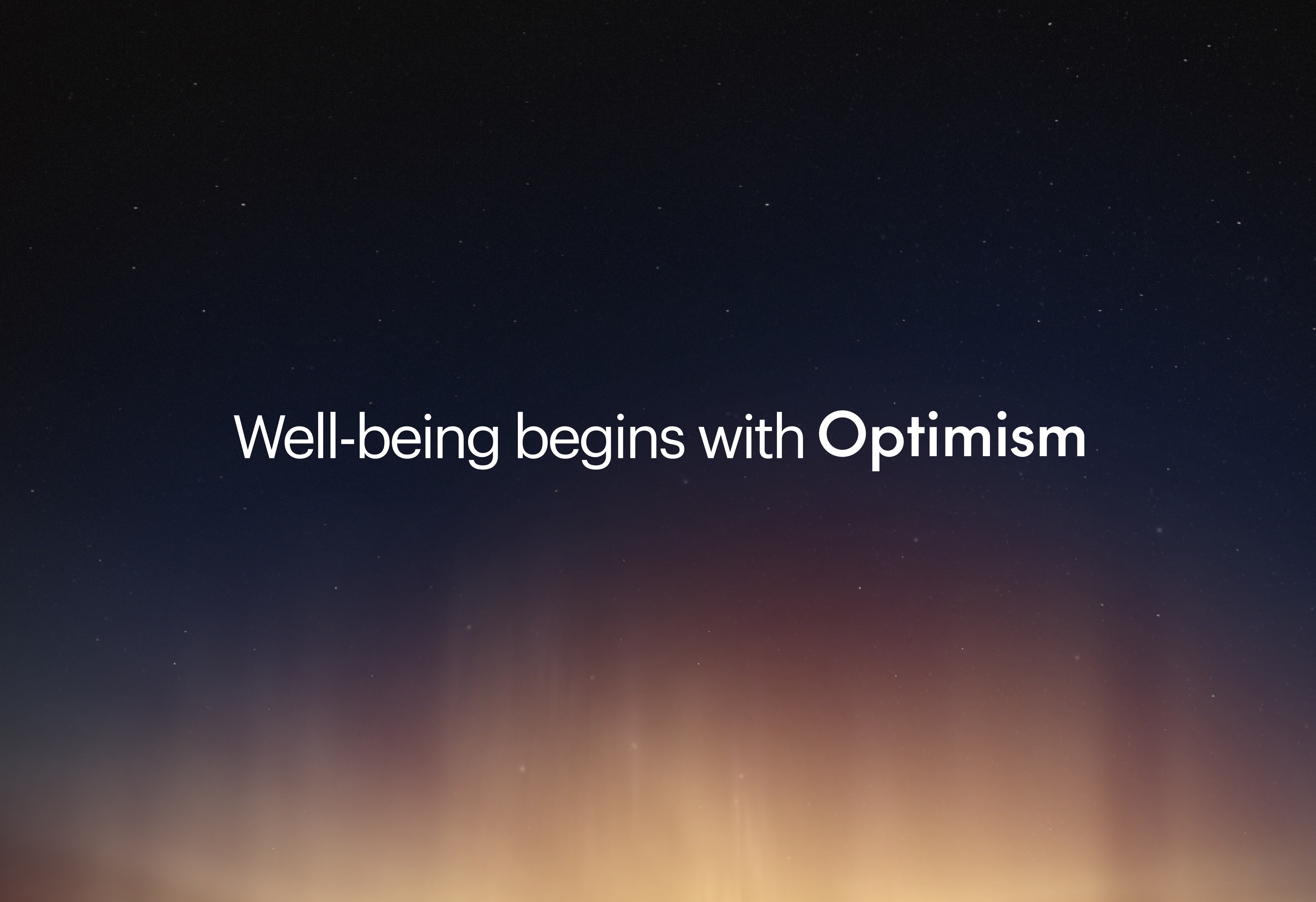
Optimism — Well-being begins with Optimism

Media & Technology Brand

Client work via Pardon.

Optimism

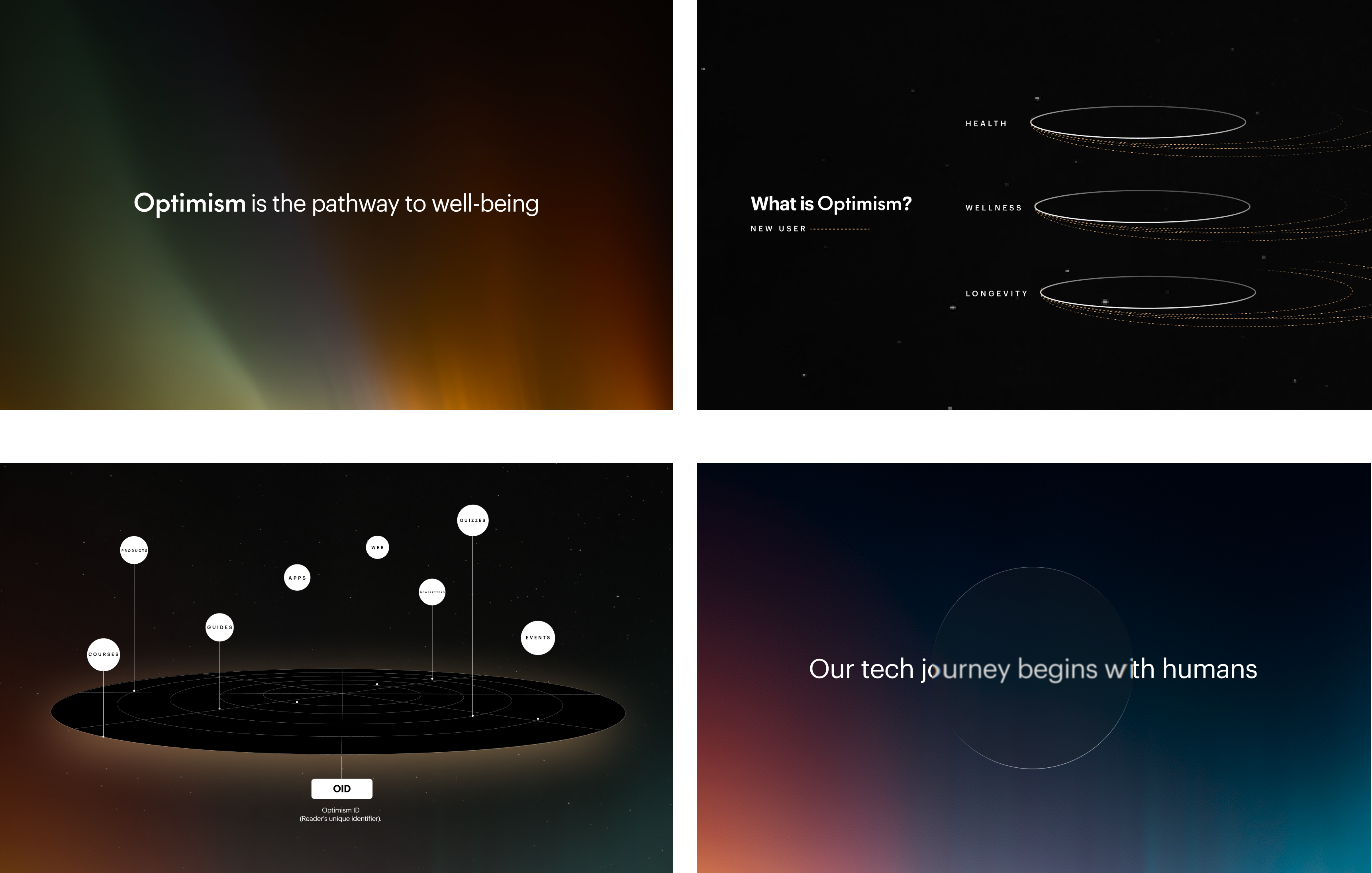
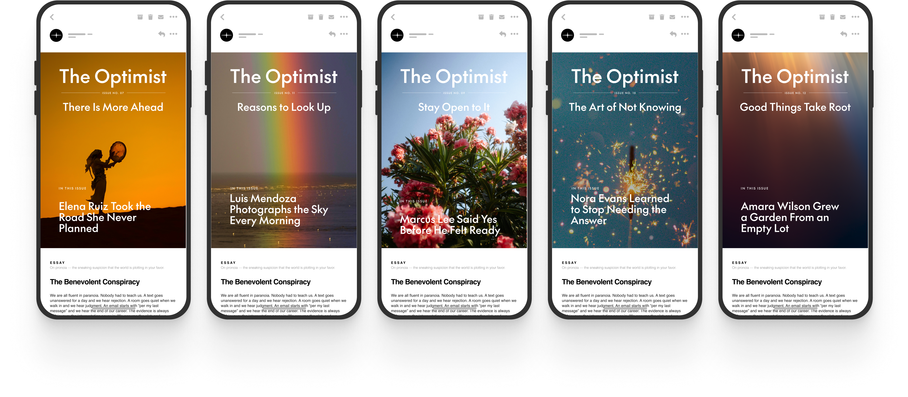
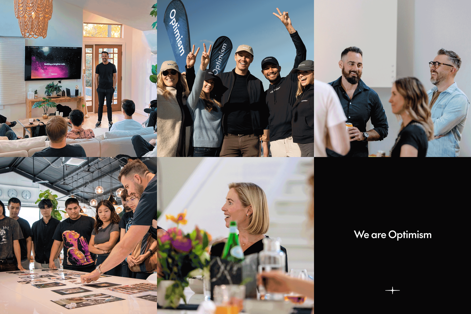
Optimism is the well-being platform behind a portfolio of flagship inbox-first brands — including Super Age, All Healthy, and Ageist — connecting expertise from the inbox to the web to real life through live events, immersions, and community experiences.

We built the brand identity to hold that structure together: one platform, one visual language, flexible enough to house distinct publications while keeping the throughline of optimism — grounded, not naive — legible across every touchpoint. All Healthy alone reaches 1.3M+ daily readers.

Role
Design Lead

Deliverables
Concepting
Brand Development
Brand Strategy

Website
optimism.com ↗

Initial concepts for the brand

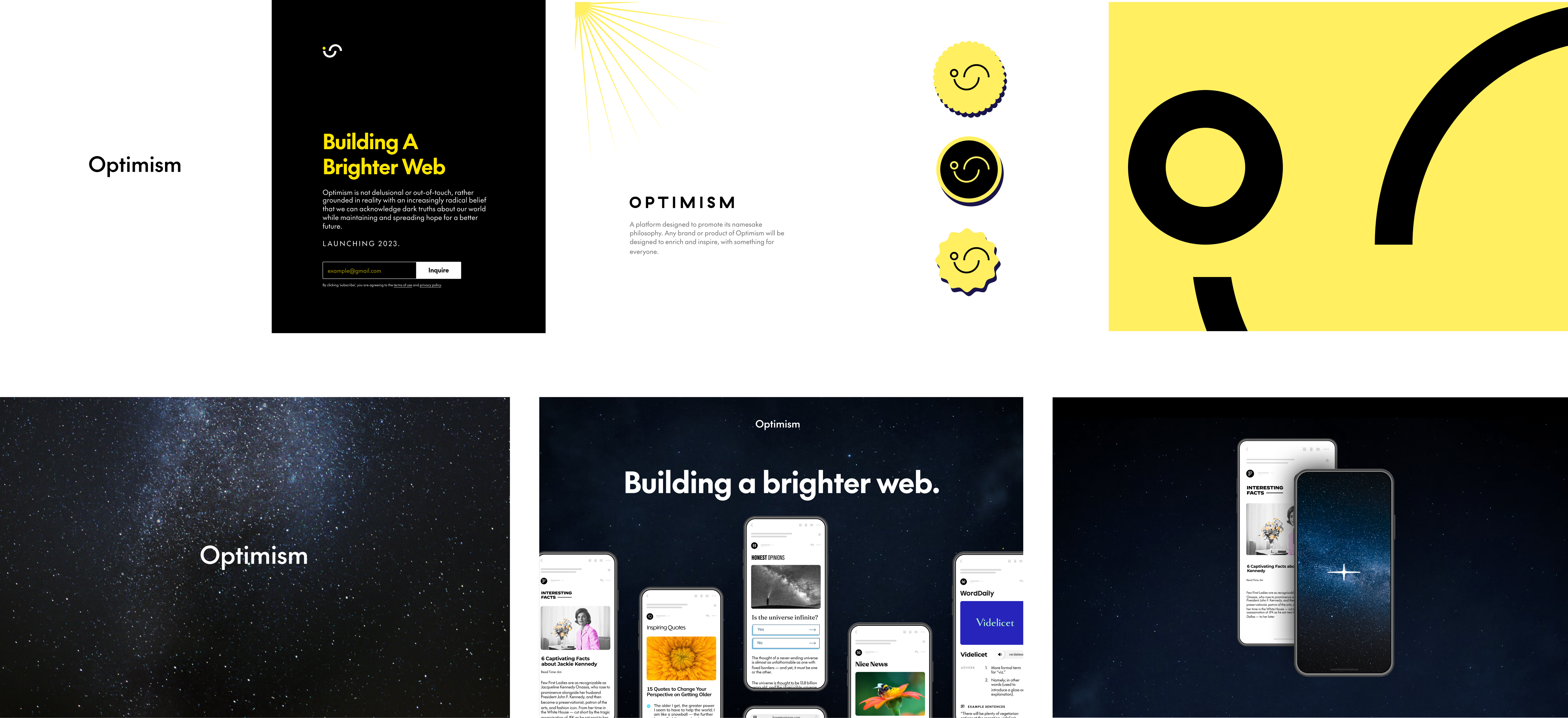
Initial Optimism brand concepts — early wordmark, logomark, and landing page explorations

Initial type personalities

Optimism typeface treatment row
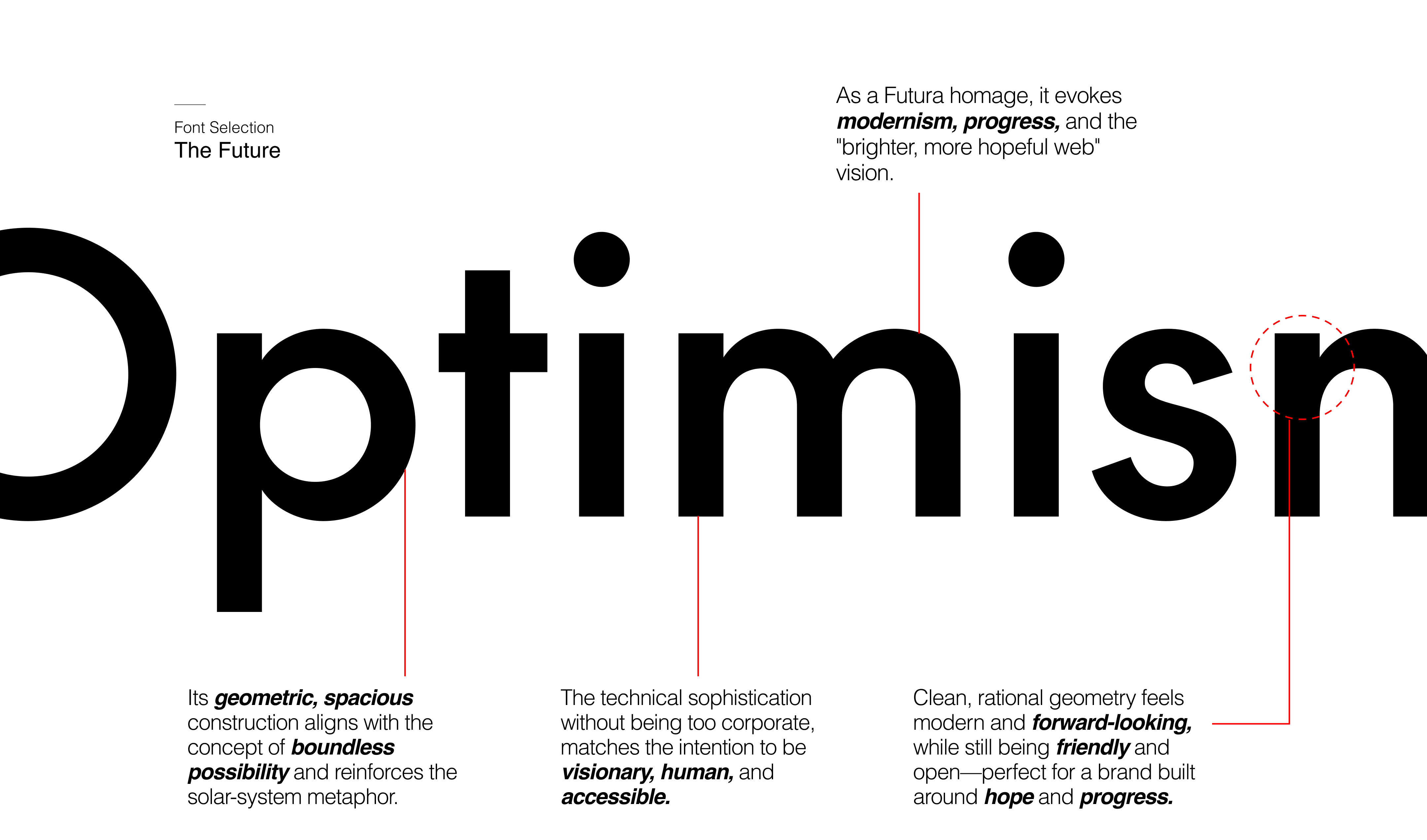
Font Selection — The Future annotation
Logomark exploration — six directions

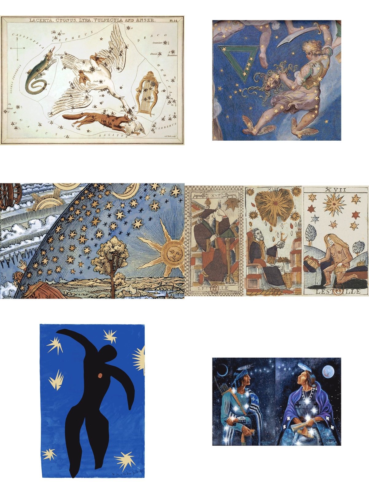
Optimism is our North Star—steady, bright, and expansive. It represents the energy that pulls people forward, offering clarity and direction even in uncertain moments. Like a constant celestial marker, optimism reminds us that progress is always possible and the future is always within reach.

Optimism logomark construction

Logomark Construction

Optimism postcard tile — website screen expressions
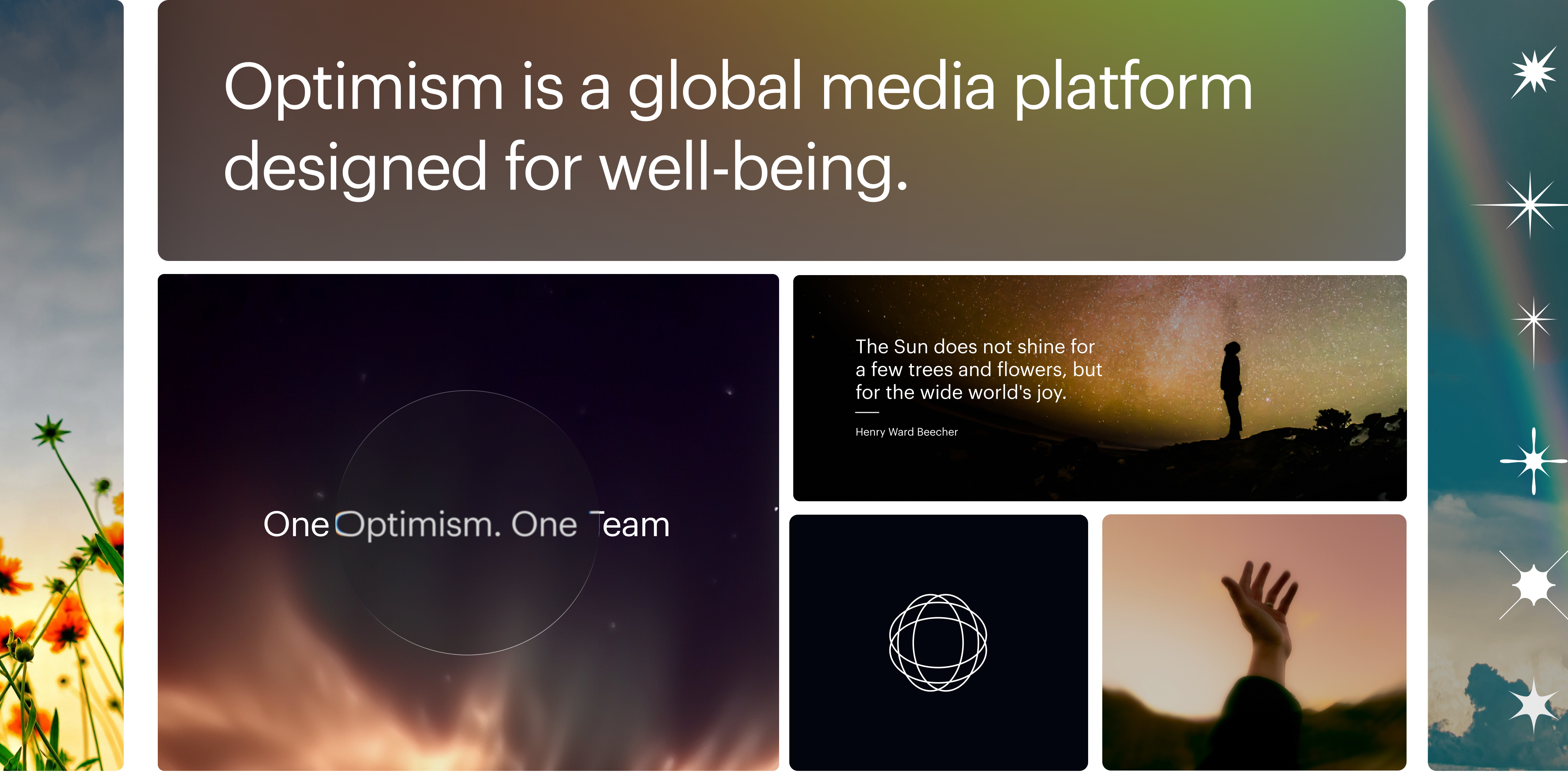
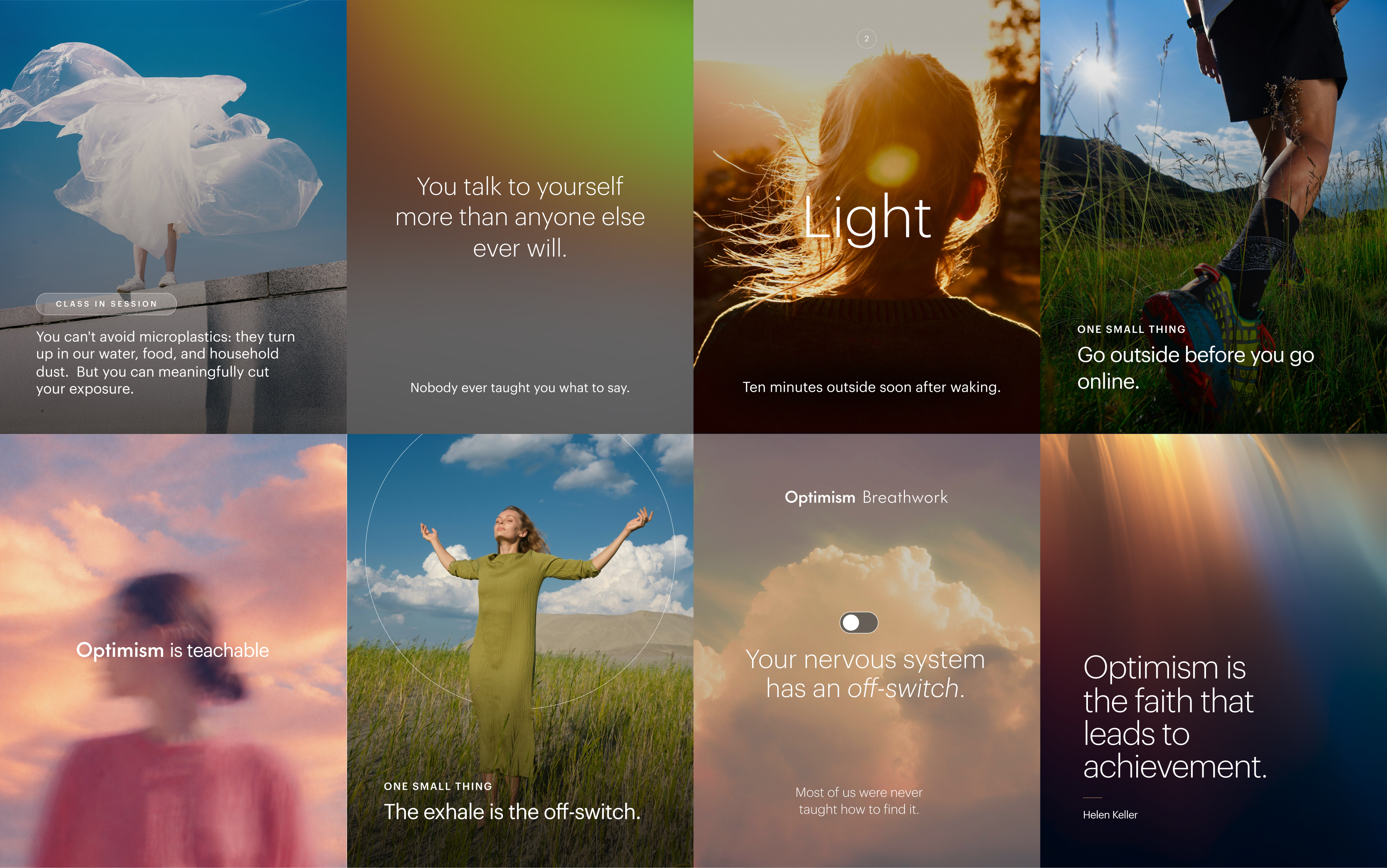
Optimism is a global media platform designed for well-being — brand tile applications

Brand Vibe

Website expression

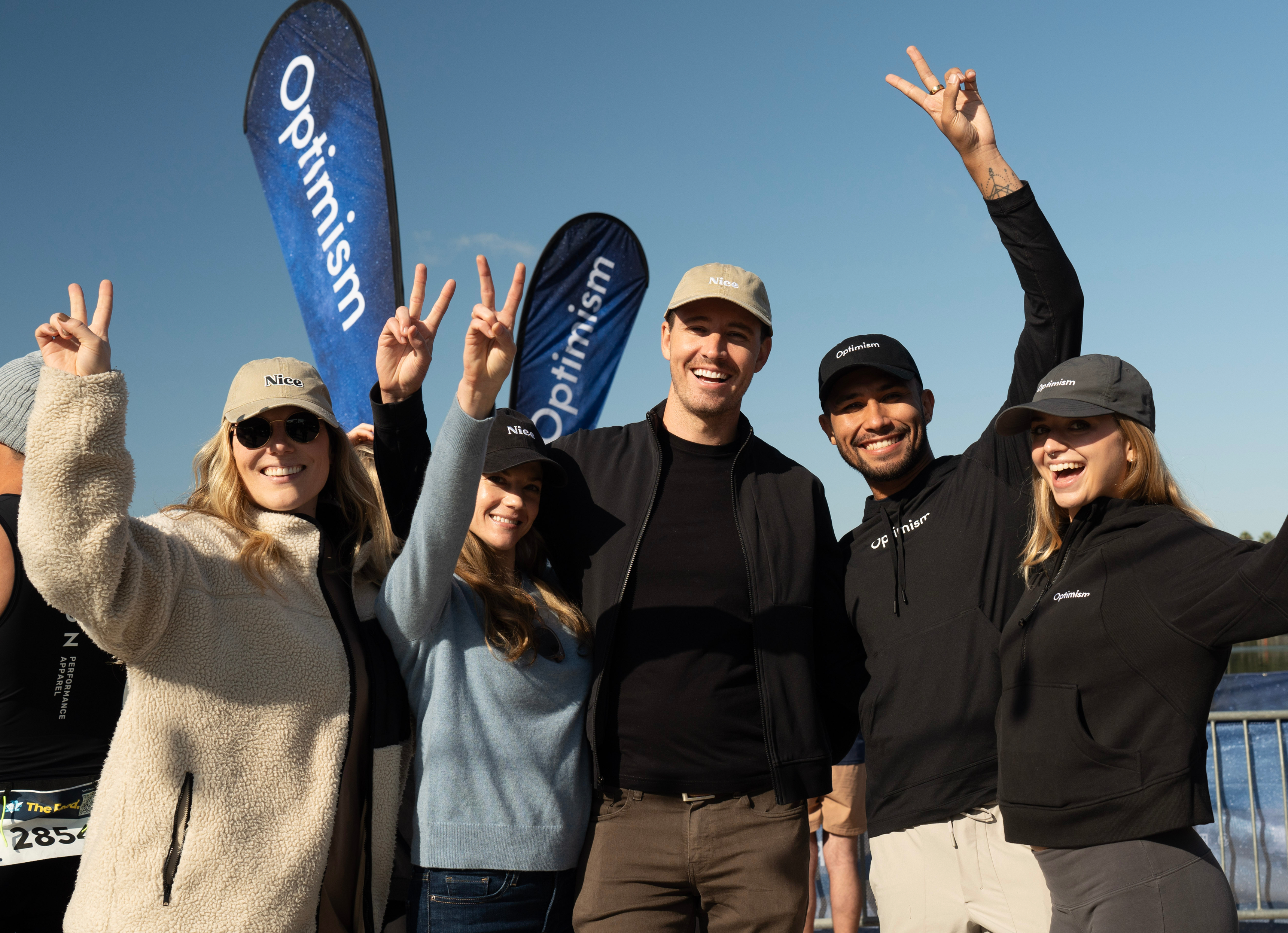
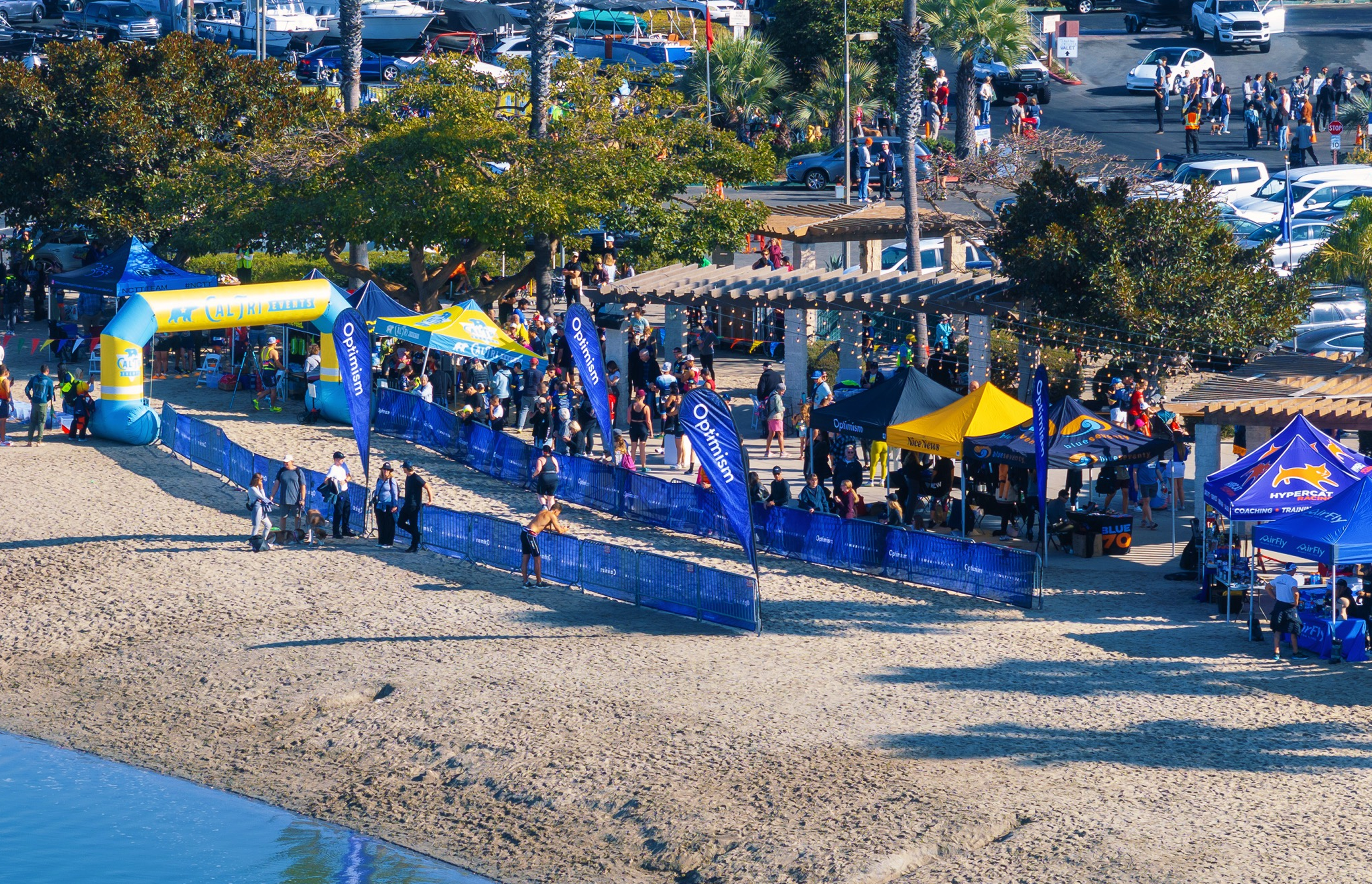
Optimism activation event photo Optimism activation event photo

Optimism live activations

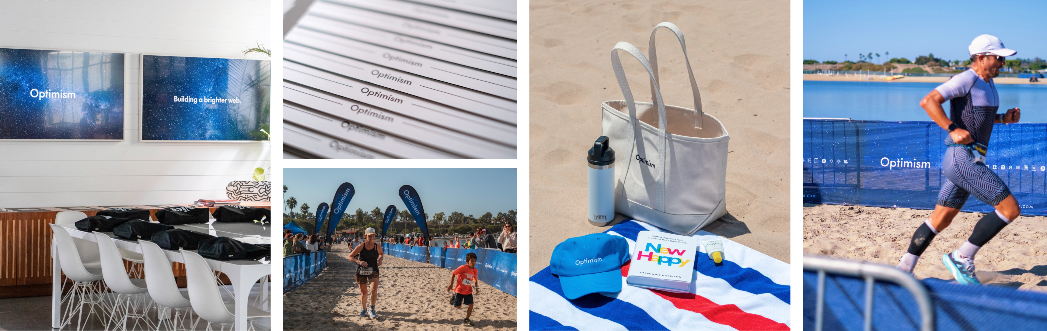
Optimism brand in the real world — office signage, printed cards, race day activation, merchandise, and triathlon event

In the wild

Simple — Simple solutions for complex times

Media & Knowledge Platform

Concept work for Simple via Pardon — proposed rebrand, not implemented.

Simple

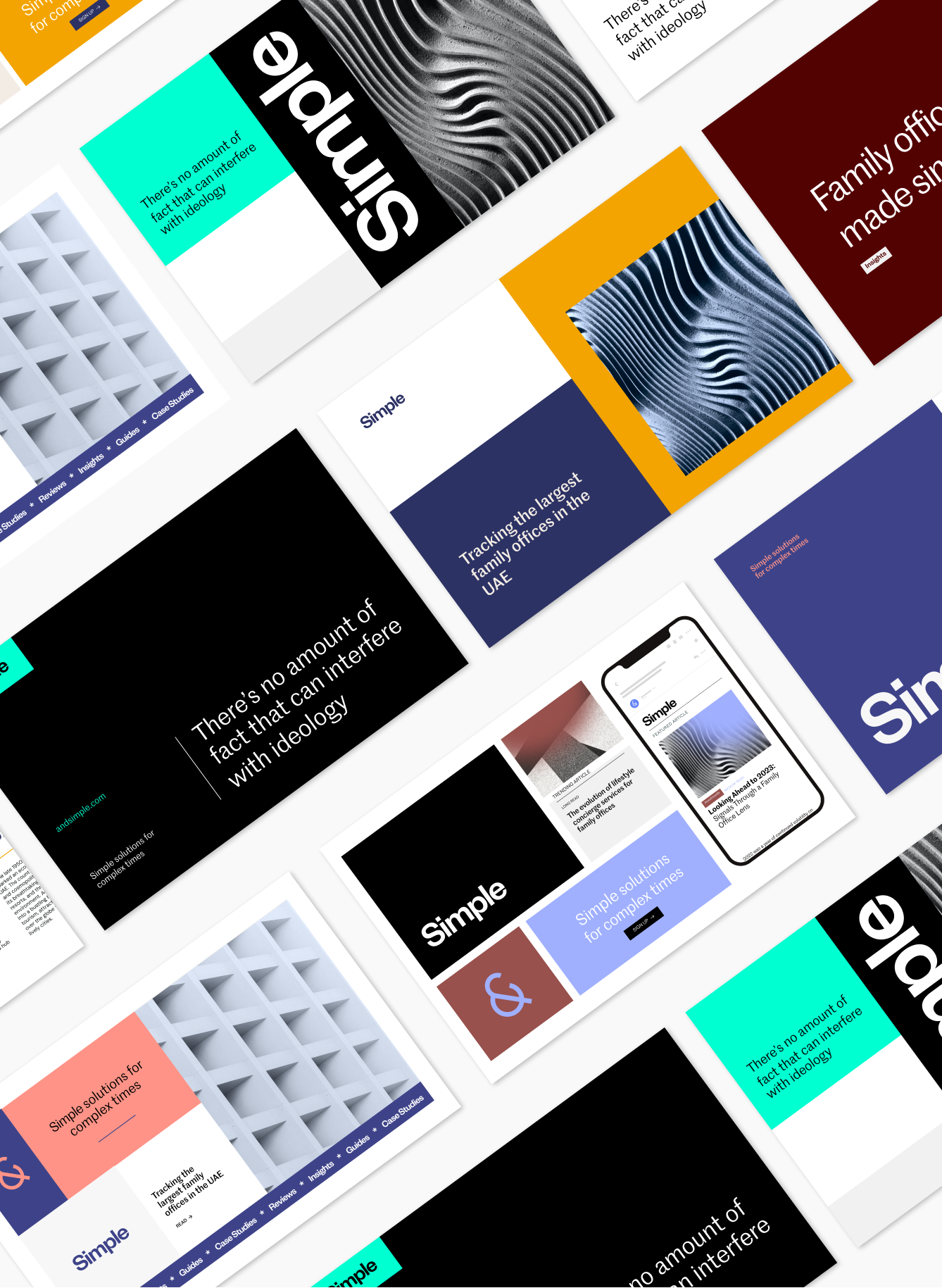
Simple is the leading independent provider of knowledge, data, and access for the next generation of family offices — connecting them with experts and best-in-class suppliers across the ecosystem.

We developed a brand built on clarity: a refined ampersand-derived mark and a restructured wordmark, designed to bring simplicity and confidence to a famously complex world.

Role
Senior Designer

Deliverables
Concepting
Brand Development
Brand Strategy

Initial concepts for the brand

Initial mockup concepts for the Simple brand

Initial type personalities

Simple typeface treatment row
Wordmark structural refinement annotation
Simple wordmark before and after rework
Ampersand study — refining the symbol at the heart of the mark

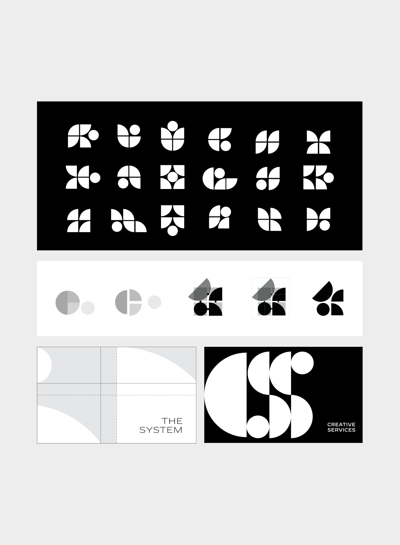
We studied a range of ampersand directions to see whether a new symbol could better fit the concept, but ultimately kept the existing mark for brand recognition — refining it into a more geometric, elevated version of itself.

Logomark exploration — six directions
Simple logomark construction and refinement

Brand vibe

Simple brand vibe — mood, texture, and color
Simple newsletter and app mockup
Simple website mockup
Simple billboard application in Amsterdam
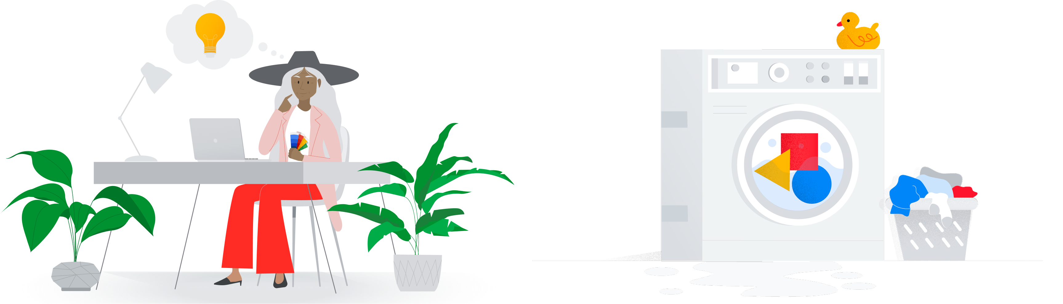
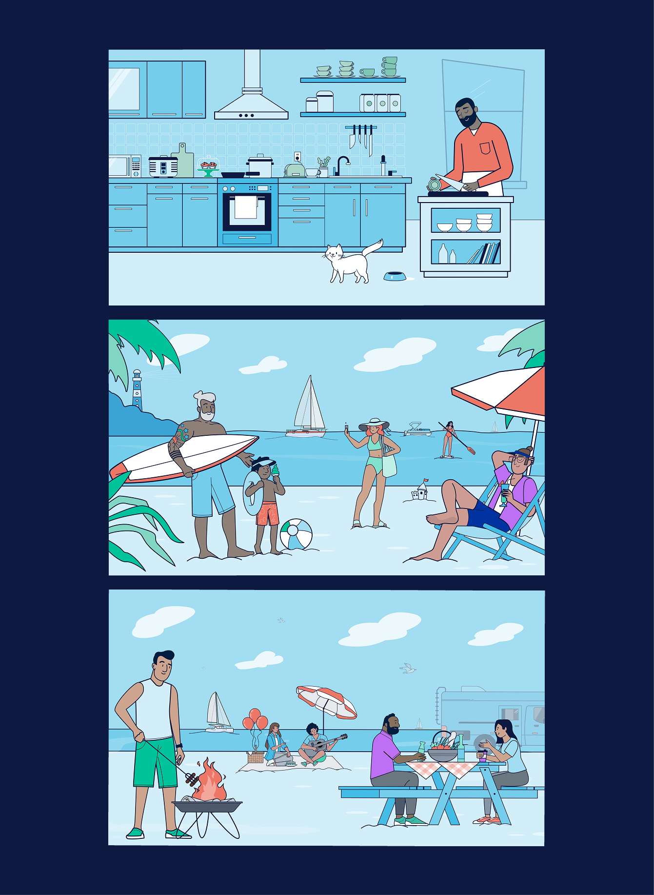
Illustration of a woman working from home, part of the Skillshop visual system

Technology Company

Google

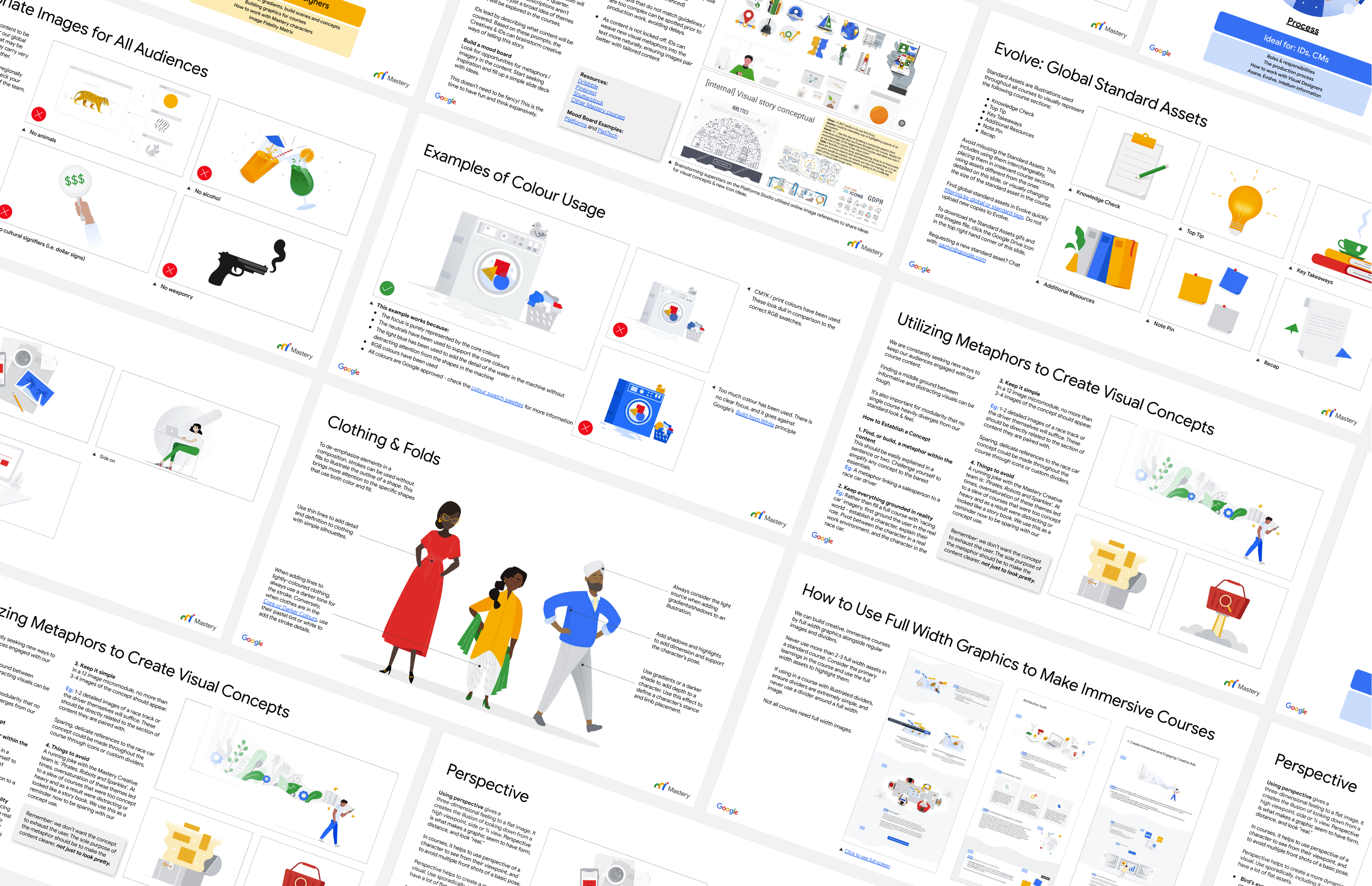
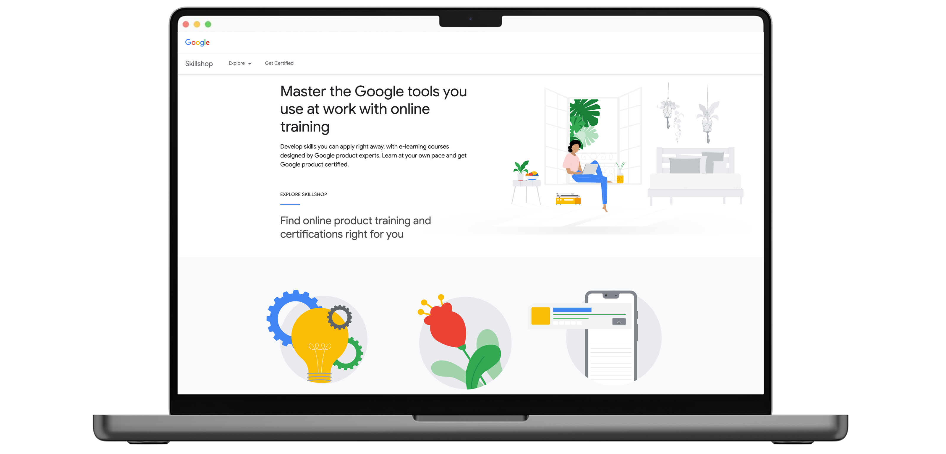
Created digital illustrations and visual assets for Google's e-learning courses, including UX and UI prototyping and strategy following the rollout of a new style guide. Collaborated with the team to develop a diverse array of visual assets for digital and print, alongside contributions to "Skillshop," Google's online training platform.

Google's Sales Mastery program focused on enhancing sales skills through tailored e-learning resources. Delivered 1,000+ visual assets annually — illustrations, templates, and course graphics — across hundreds of courses a year, contributing to a 10% increase in learner engagement and 5% revenue growth for Google's sales organization.

Role
Visual Designer

Deliverables
Concepting
Brand Development
Brand Roll out

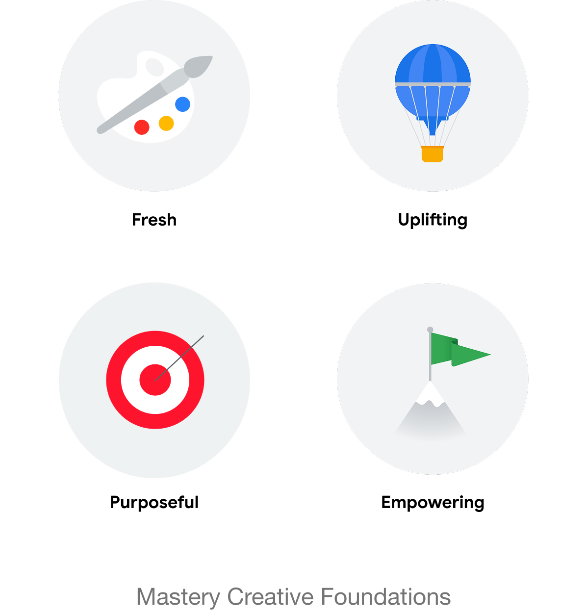
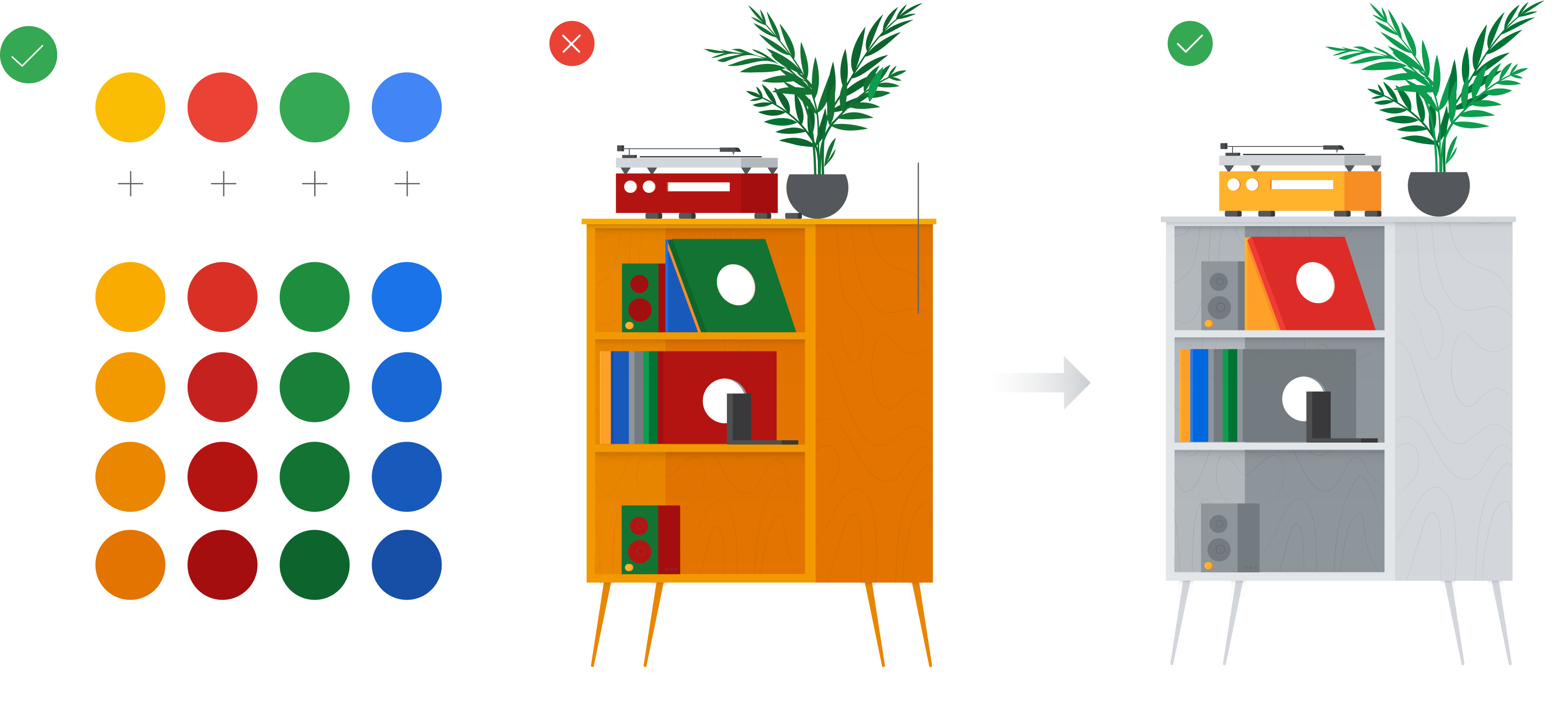
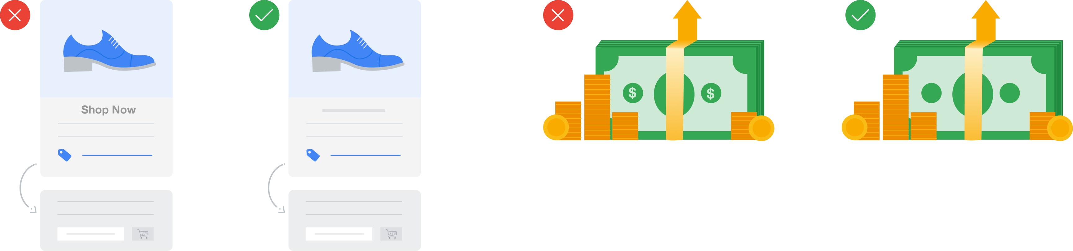
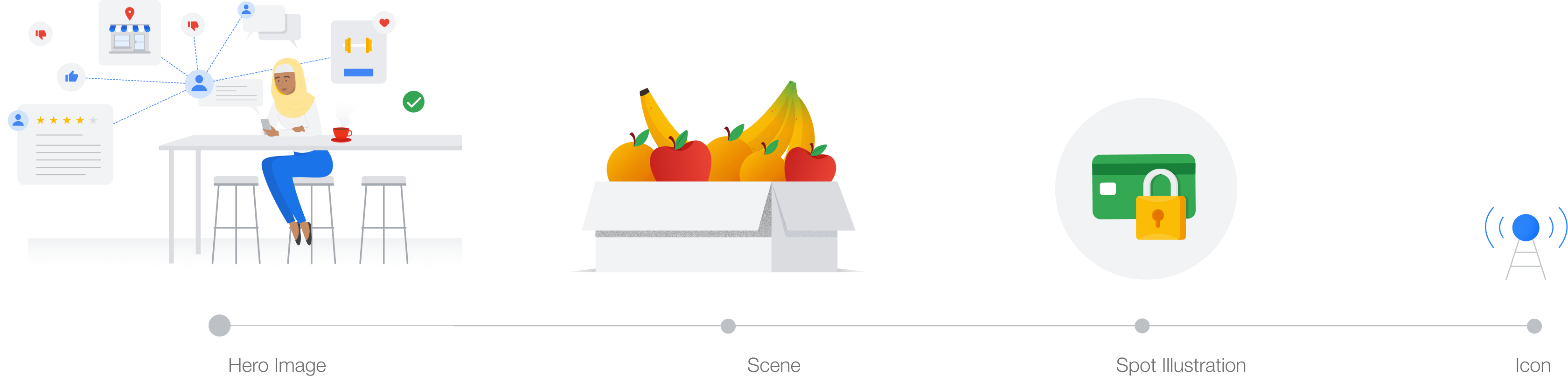
Google Mastery brand guideline pages — illustration style, color usage, and metaphor examples
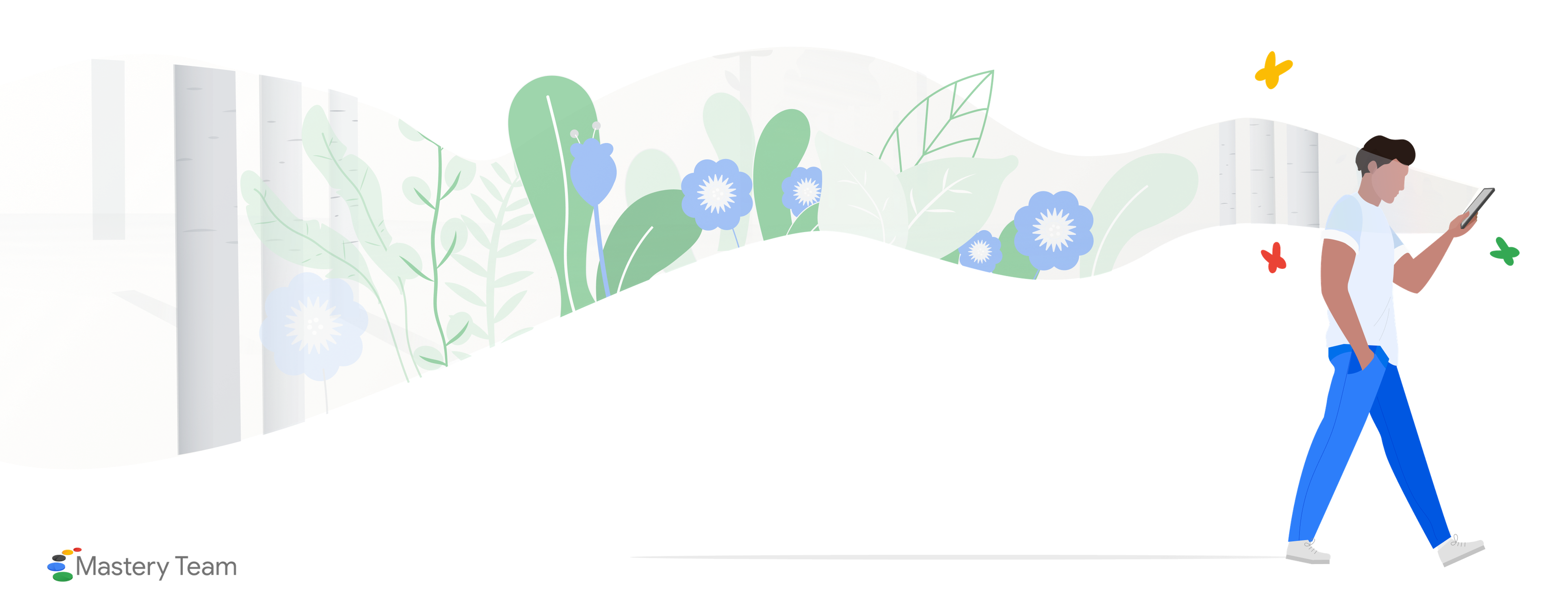
Google Mastery Team illustration — figure walking beside a wave of foliage
Diverse character lineup illustrated for the Google Mastery brand
Google Skillshop landing page mockup on laptop
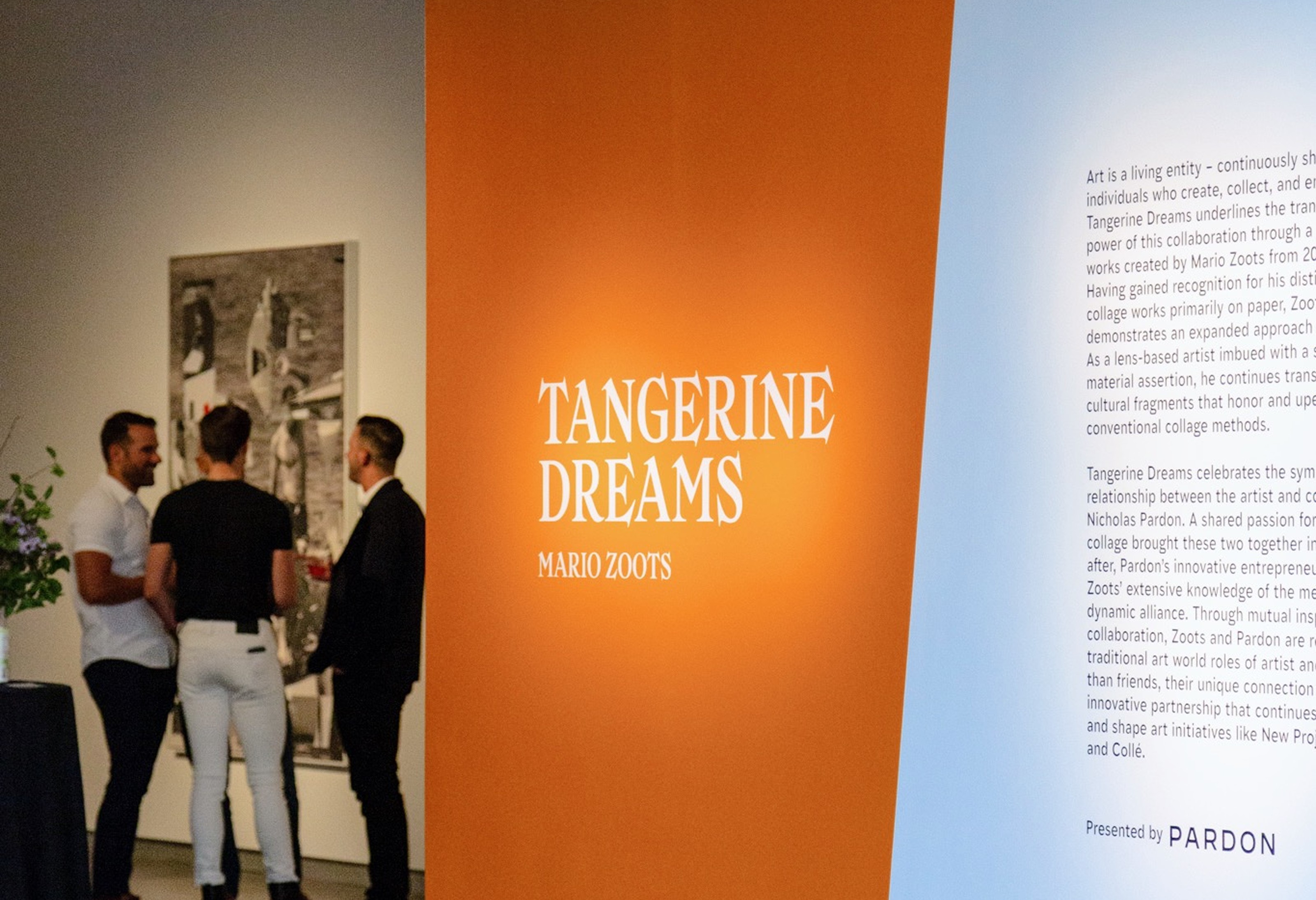
Tangerine Dreams exhibition installation — orange wall graphic with gallery visitors

Exhibition Brand Identity

Client work via Pardon.

Tangerine Dreams

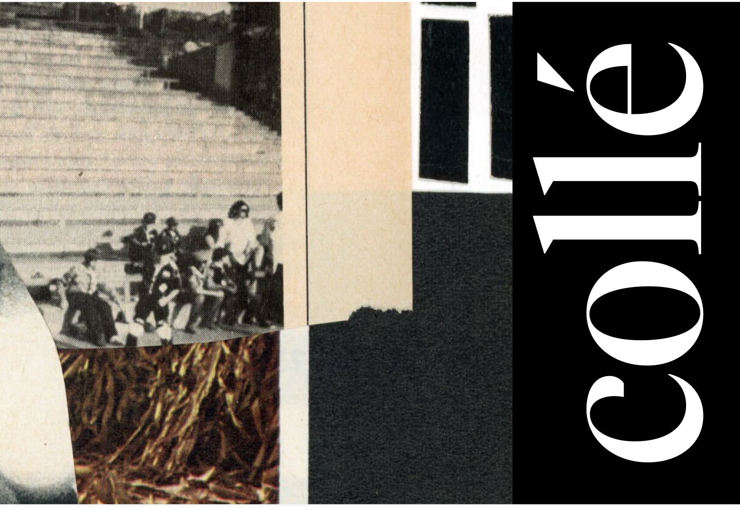
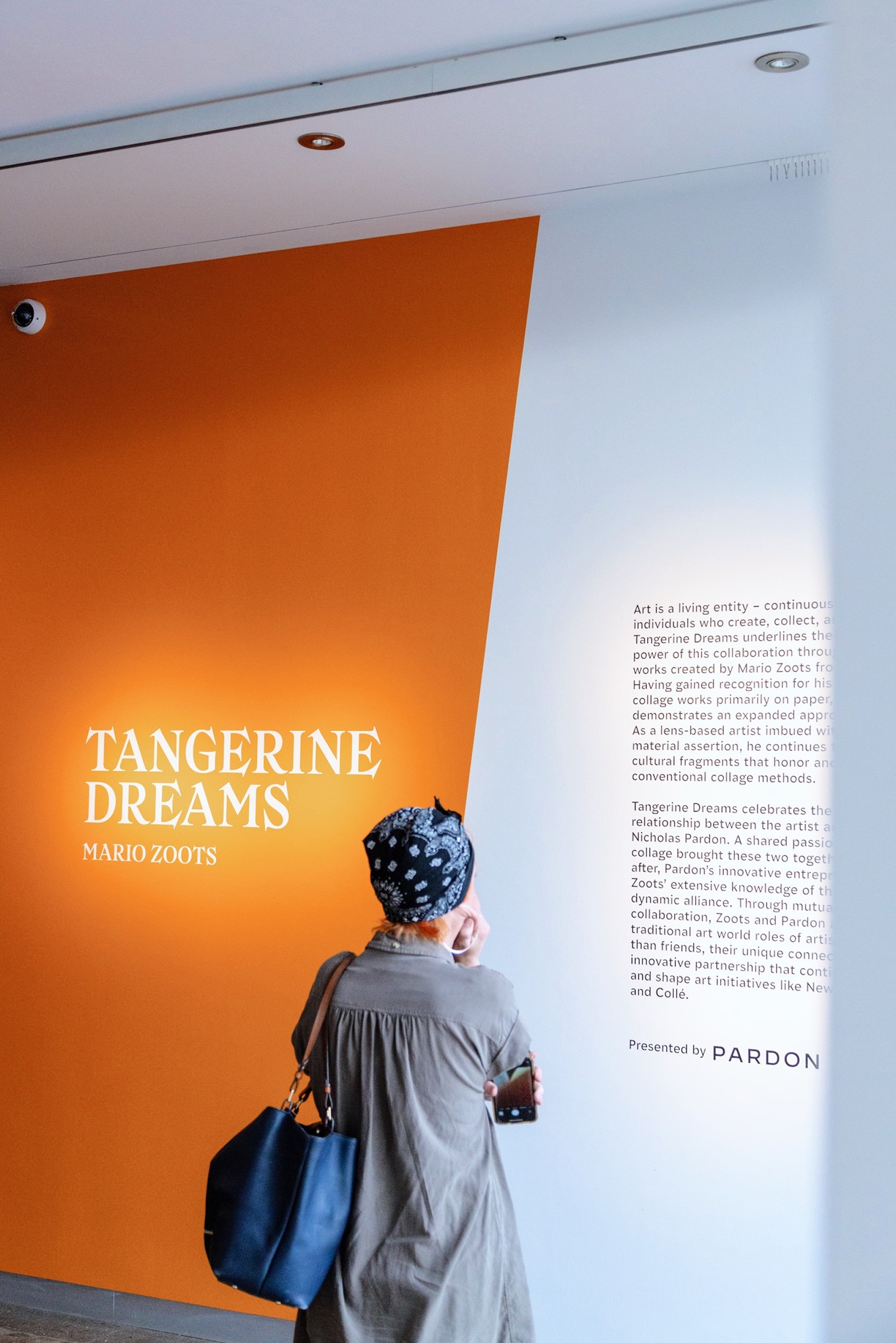
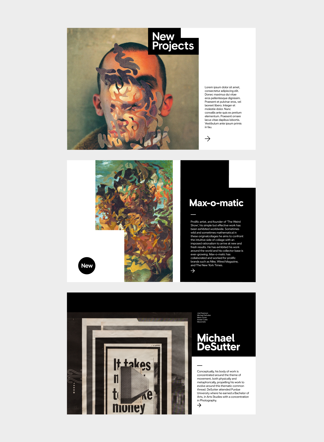
Tangerine Dreams is a group exhibition celebrating the collaborative relationship between artist Mario Zoots and collector Nicholas Pardon. Known for his distinctive collage work primarily on paper, Zoots expands his practice here as a lens-based artist working with cultural fragments that honor and update conventional collage methods.

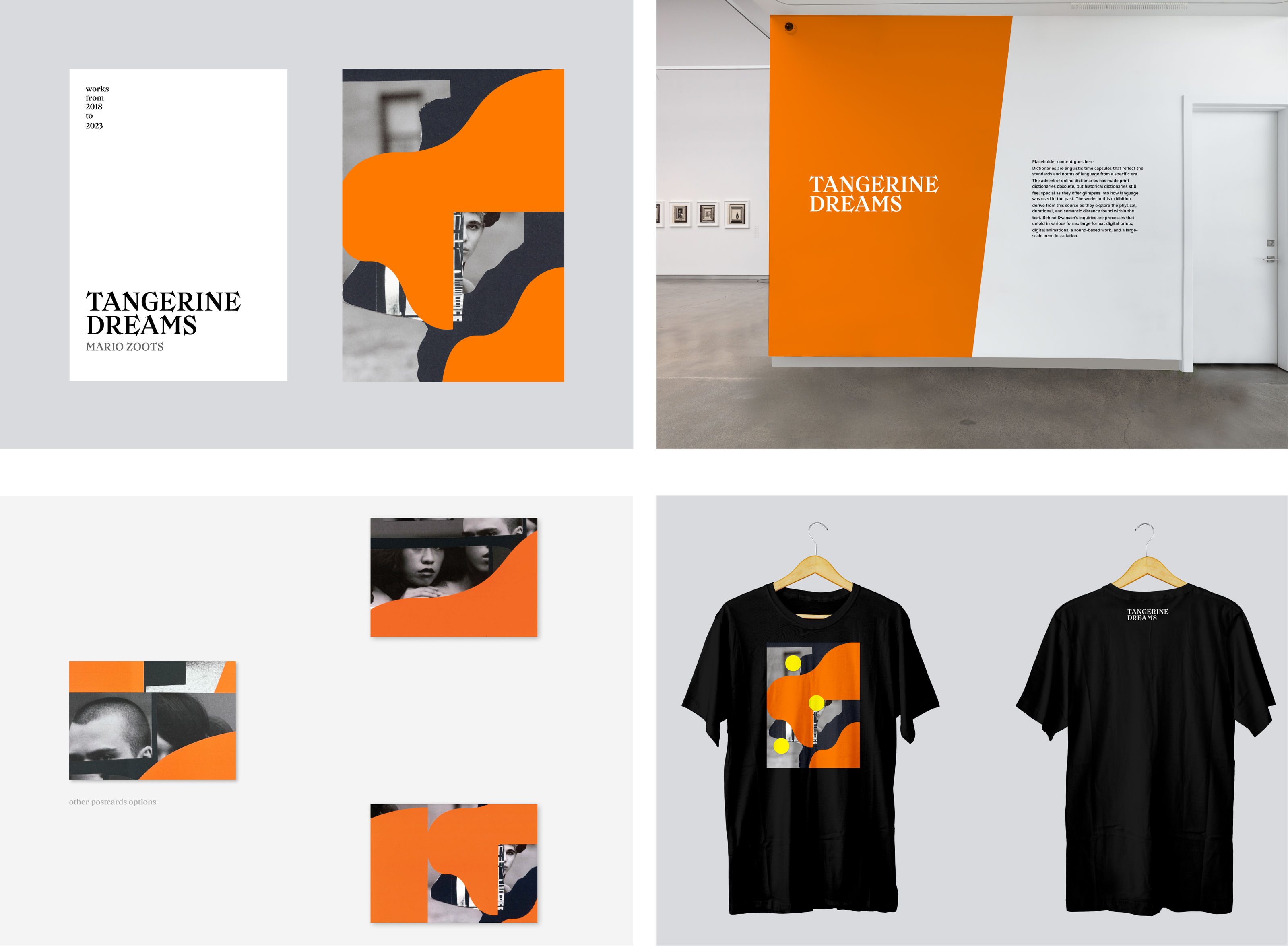
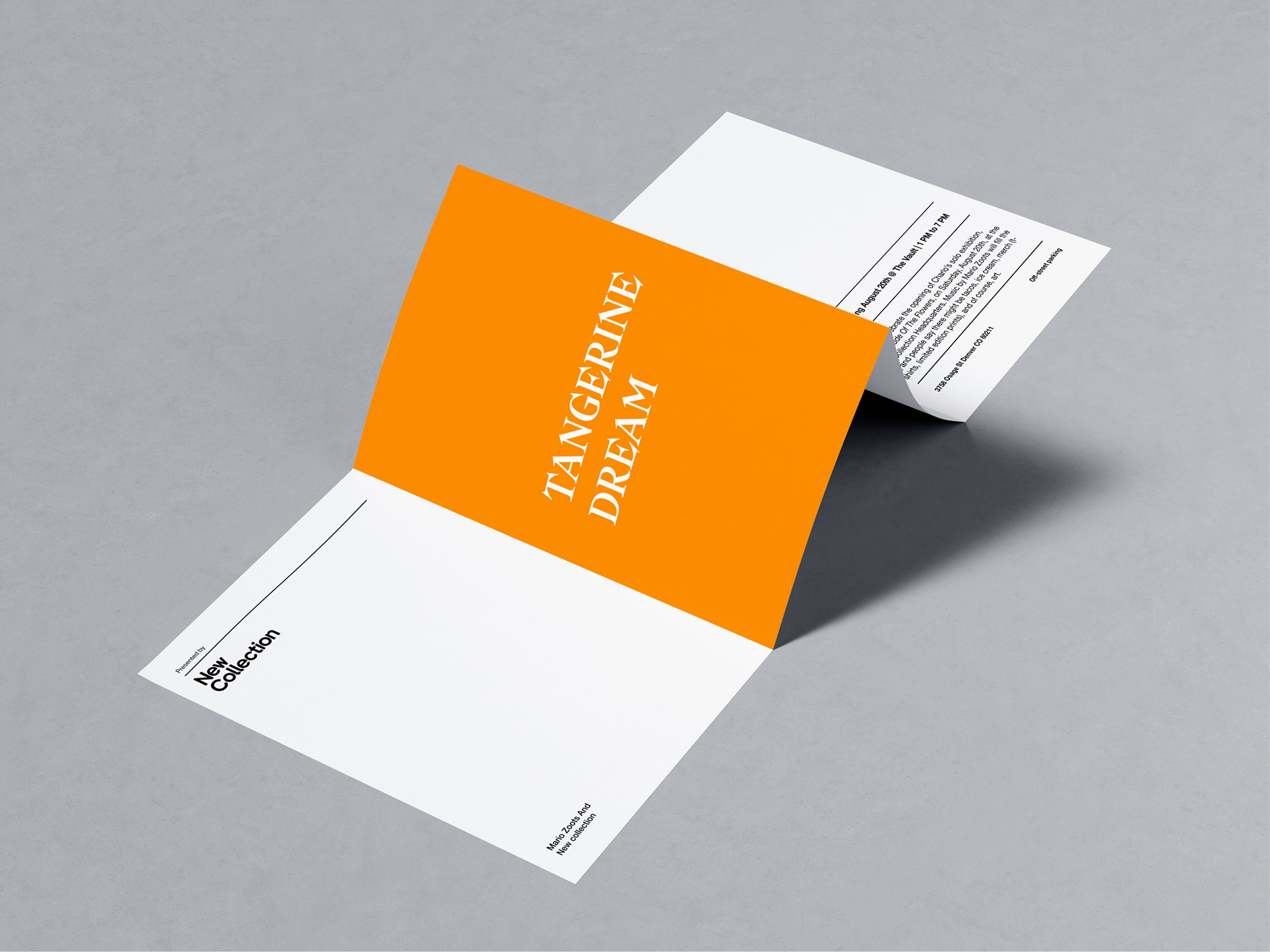
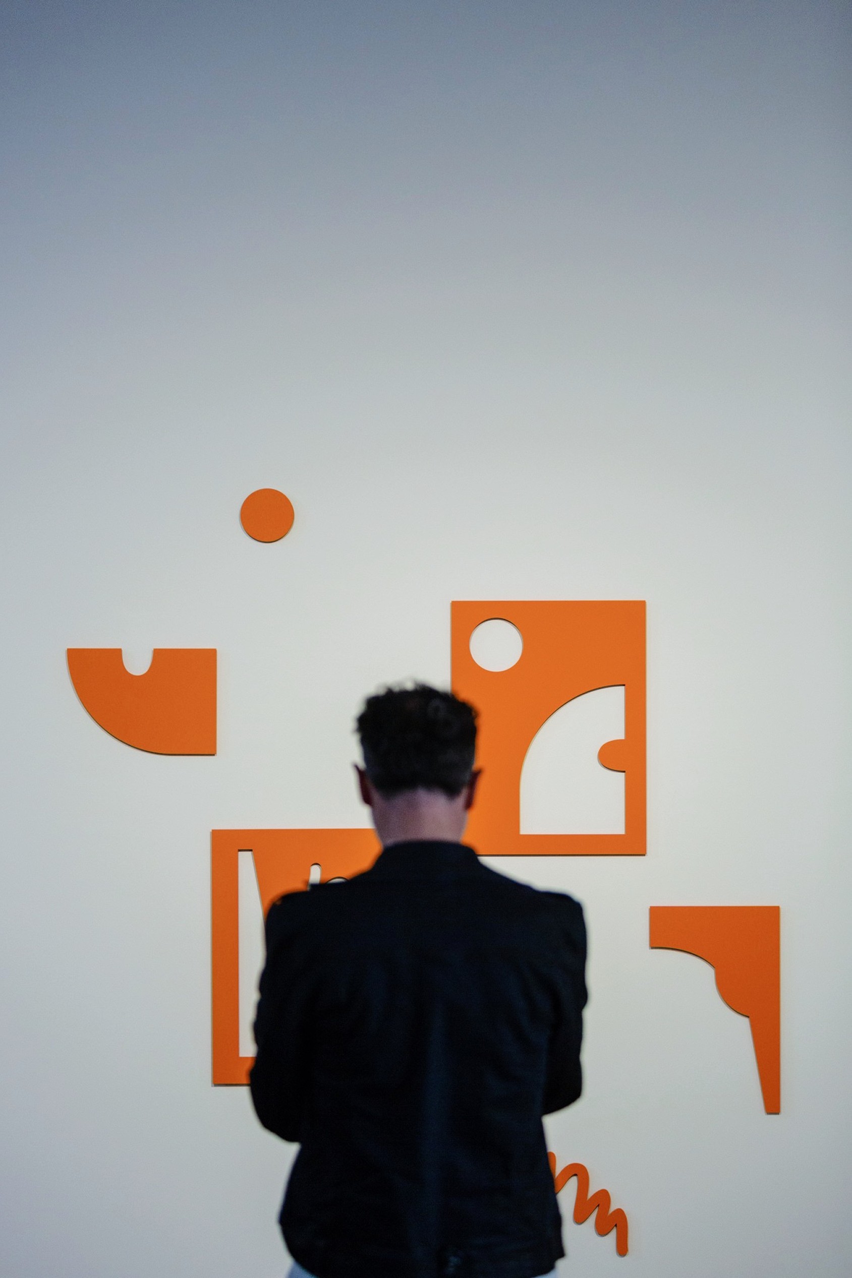
The identity carries that spirit through the show — a bold tangerine field paired with a vintage-inflected display serif, rolled out across signage, environmental graphics, invitations, and merchandise. Presented by Pardon.

Role
Senior Designer

Deliverables
Concepting
Environmental Graphics
Collateral & Merch
Brand Roll out

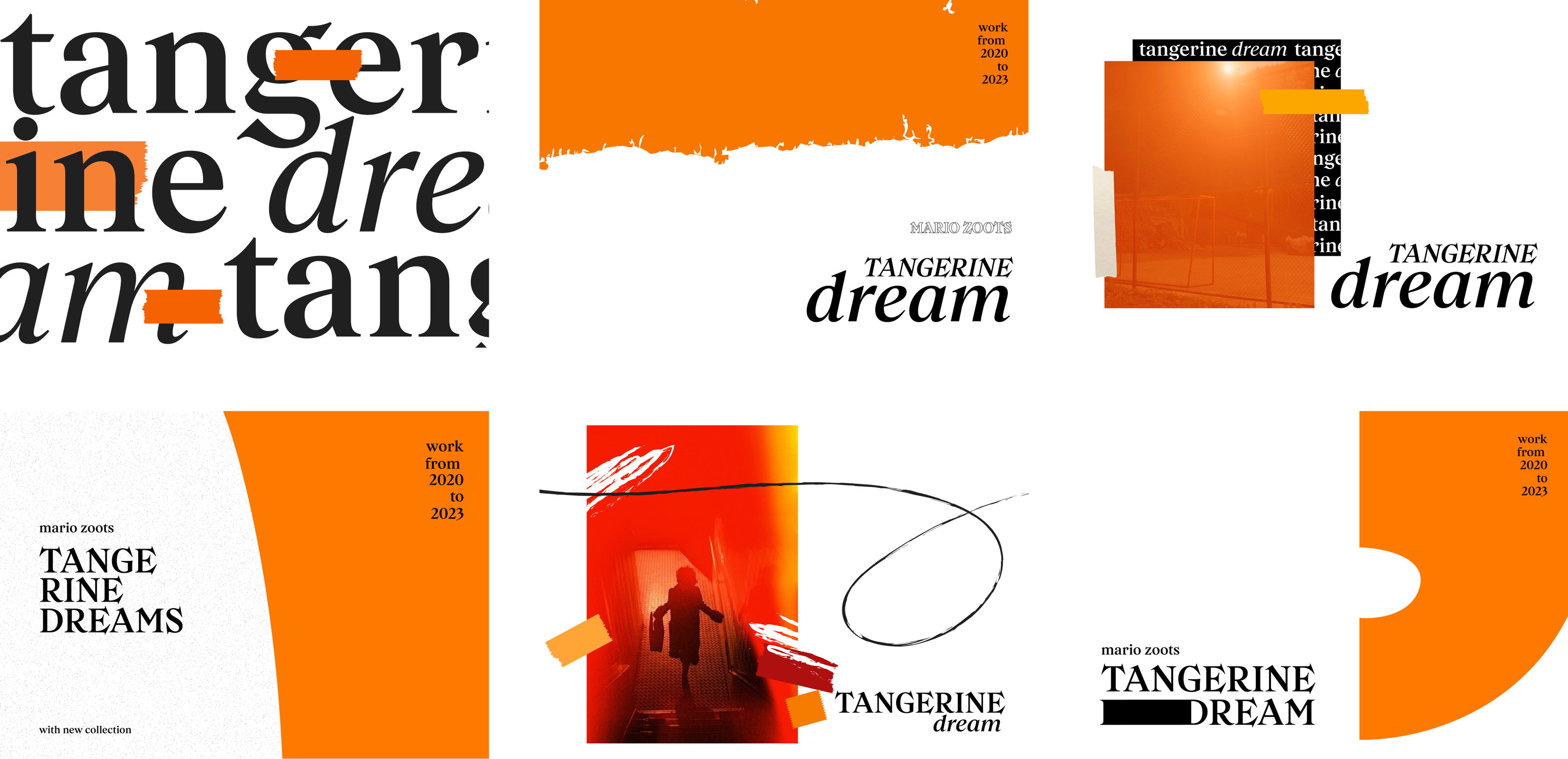
Initial concepts

Tangerine Dreams initial concepting — six wordmark and layout directions
Tangerine Dreams applications — event signage, postcards, and merchandise
Tangerine Dreams event invitation postcard mockup
Tangerine Dreams environmental wall graphics — cut orange shapes
Mario Zoots pieces
Tangerine Dreams gallery signage detail
Manifestation of the concept

Other Projects

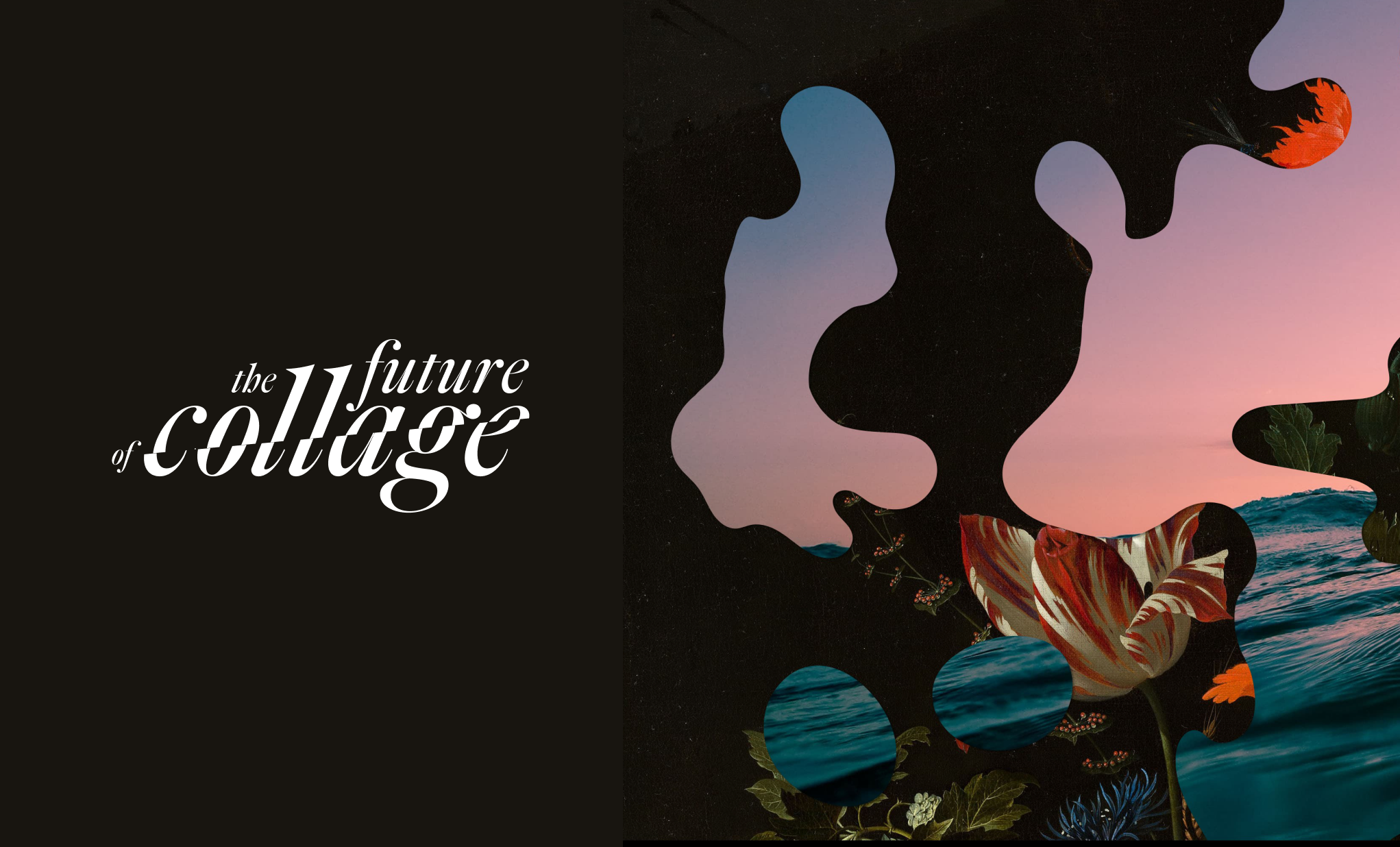
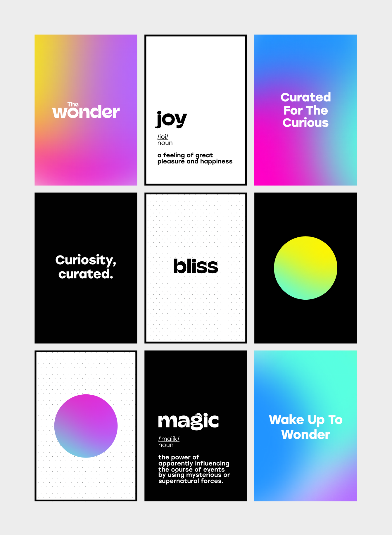
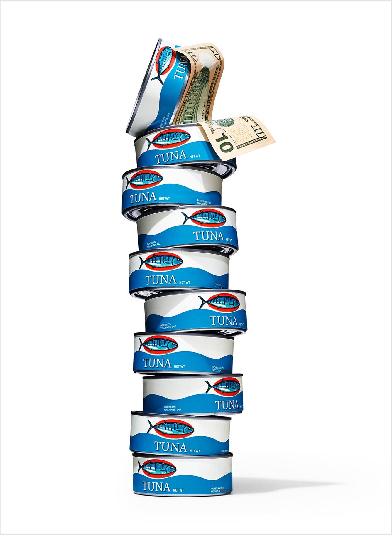
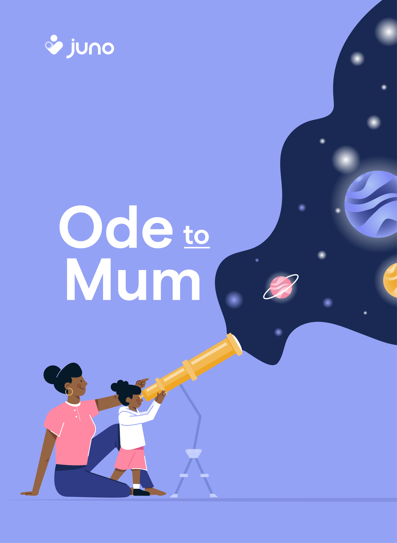
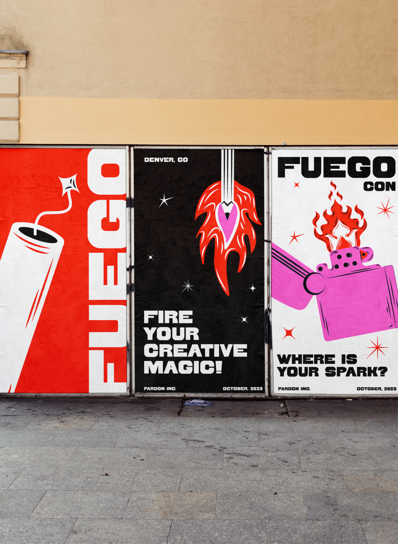
This is a compilation of works that hasn't seen the light of day — personal projects, explorations, and freelance pieces I've worked on. Hopefully, this gives a glimpse into different types of projects, creative directions, and ideas I've explored simply for fun.