Arts + Culture
New Projects
New Projects is a contemporary art space built around artists, exhibitions, and evolving forms of creative expression. The identity needed to give that variety a recognizable home without competing with the work itself.
01 / CHALLENGE
Create a recognizable identity without competing with the art.
New Projects needed a visual identity that could establish a distinct presence for the gallery while accommodating artists, exhibitions, and work with radically different aesthetics. The challenge was to create enough consistency to make every expression recognizable as New Projects without imposing a single visual style on the work it exists to support.
02 / EXPLORATION
Finding structure in the space itself.
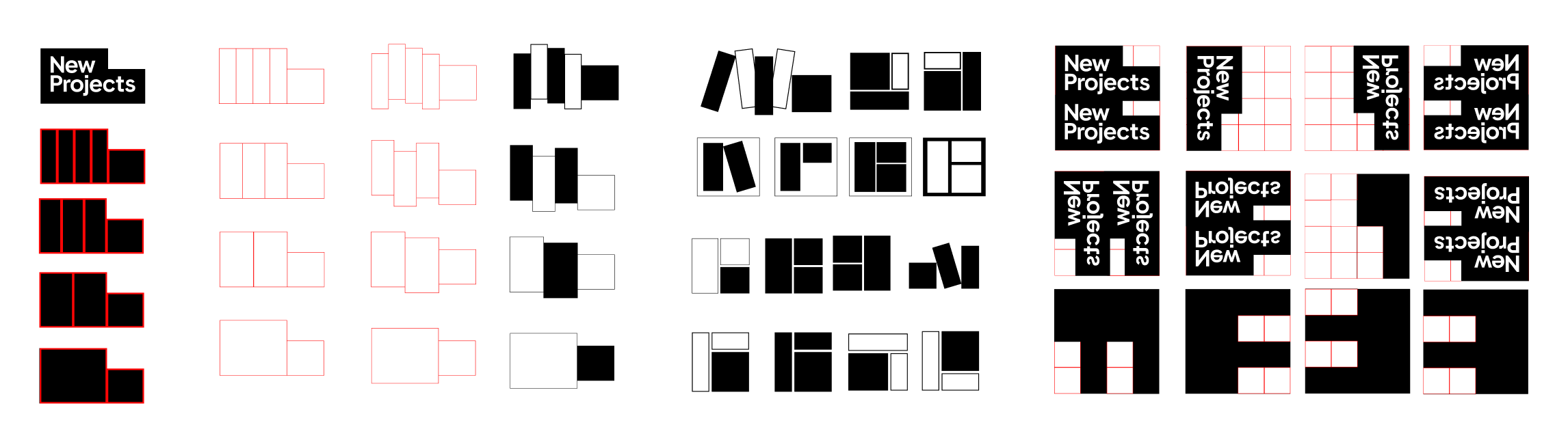
The distinctive geometry of the gallery was abstracted into a flexible shape that could frame, divide, crop, and organize content across the brand. Instead of becoming another decorative layer, it created an underlying structure capable of adapting to different artists, exhibitions, and formats.



03 / CHOSEN CREATIVE IDEA
Architecture becomes identity.
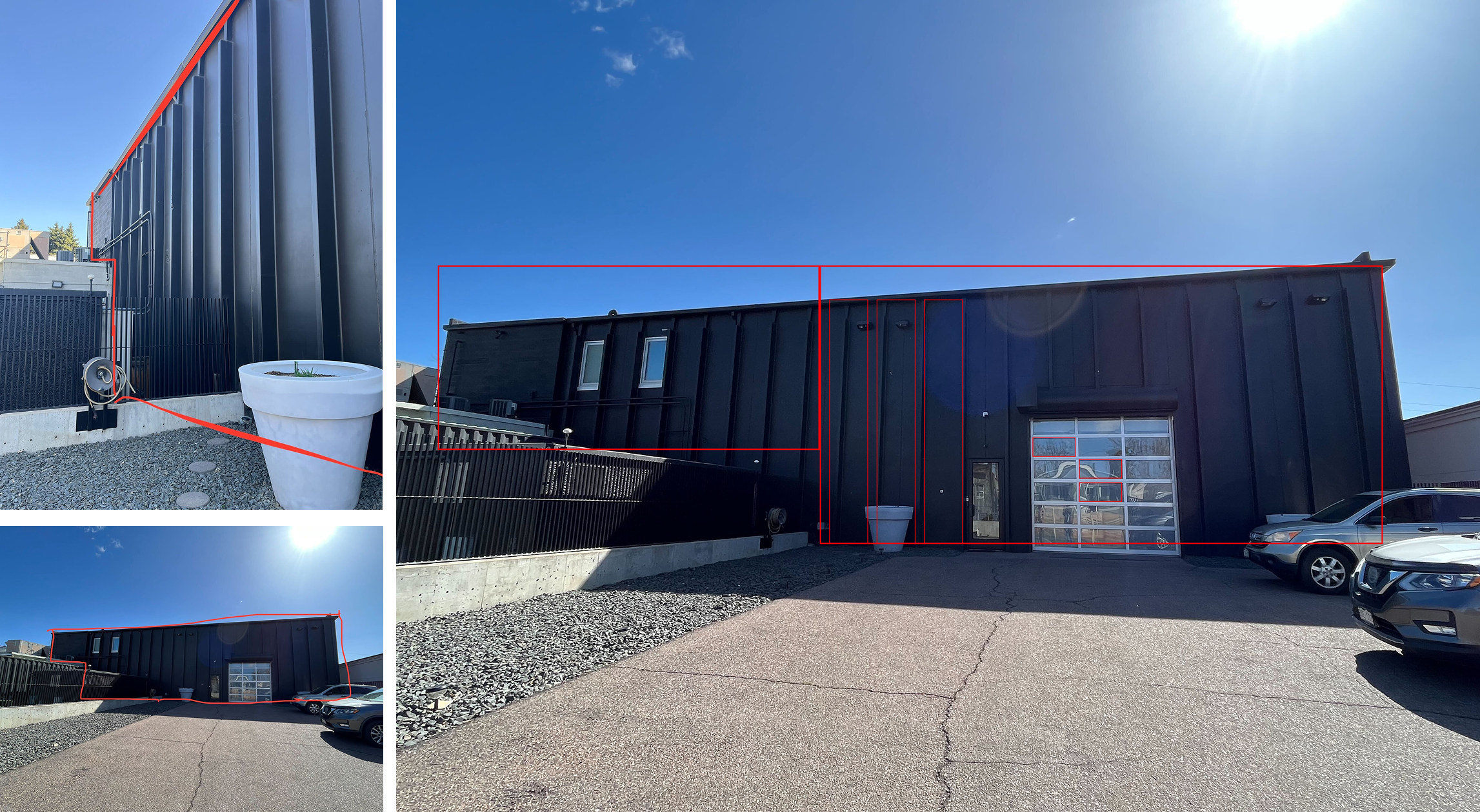
The outer form of the building and the geometry behind the wordmark converge into a distinctive angular shape. Extracted from the architecture and simplified into a flexible graphic device, it gives New Projects a visual signature that can shift in orientation and scale while remaining recognizable.
PRINCIPLE 01
Architecture becomes identity.
The outer form of the building and the geometry behind the wordmark converge into a distinctive angular shape. Extracted from the architecture and simplified into a flexible graphic device, it gives New Projects a visual signature that can shift in orientation and scale while remaining recognizable.

PRINCIPLE 02
The frame supports the work.
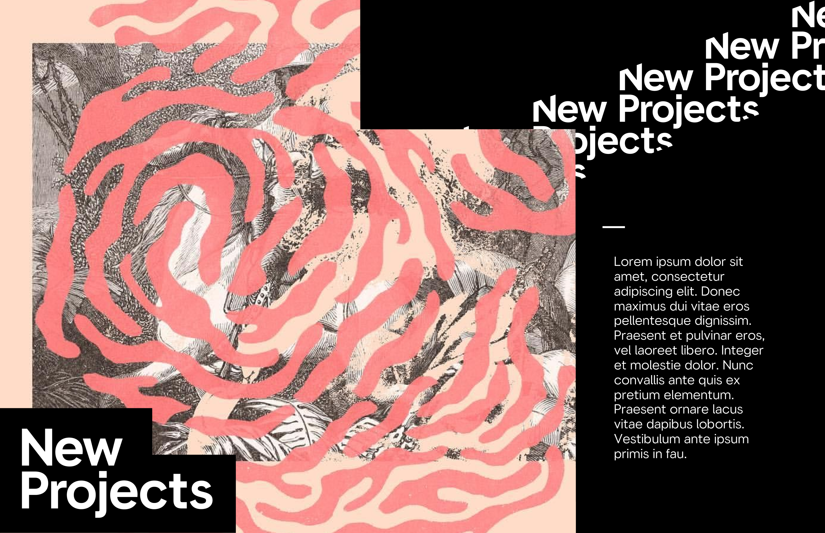
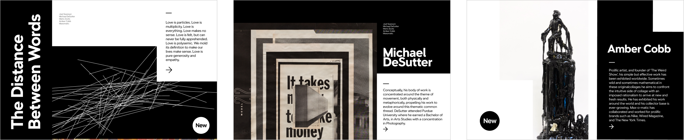
Rather than using the angle literally in every application, the geometry becomes an underlying compositional tool. It can define image containers, create divisions, establish crops, or quietly shape the background of a layout. Its presence gives different expressions a shared logic while allowing the artwork itself to remain at the center.
PRINCIPLE 03
Consistency makes room for difference.
A restrained foundation of typography, black and white, and recurring geometric relationships allows each exhibition to introduce its own imagery, color, and personality. The visual language can move from quiet to expressive depending on the artist, while the underlying structure keeps every communication connected to New Projects.

04 / SYSTEM IN ACTION
One framework, many exhibitions.
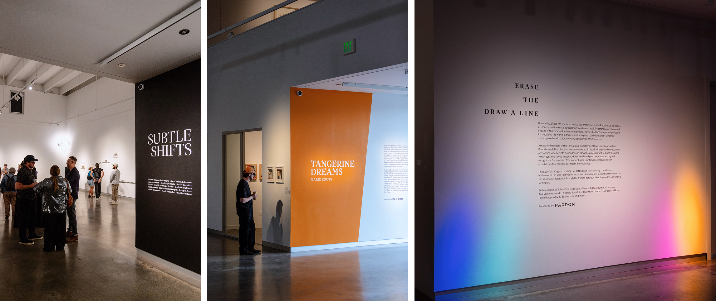
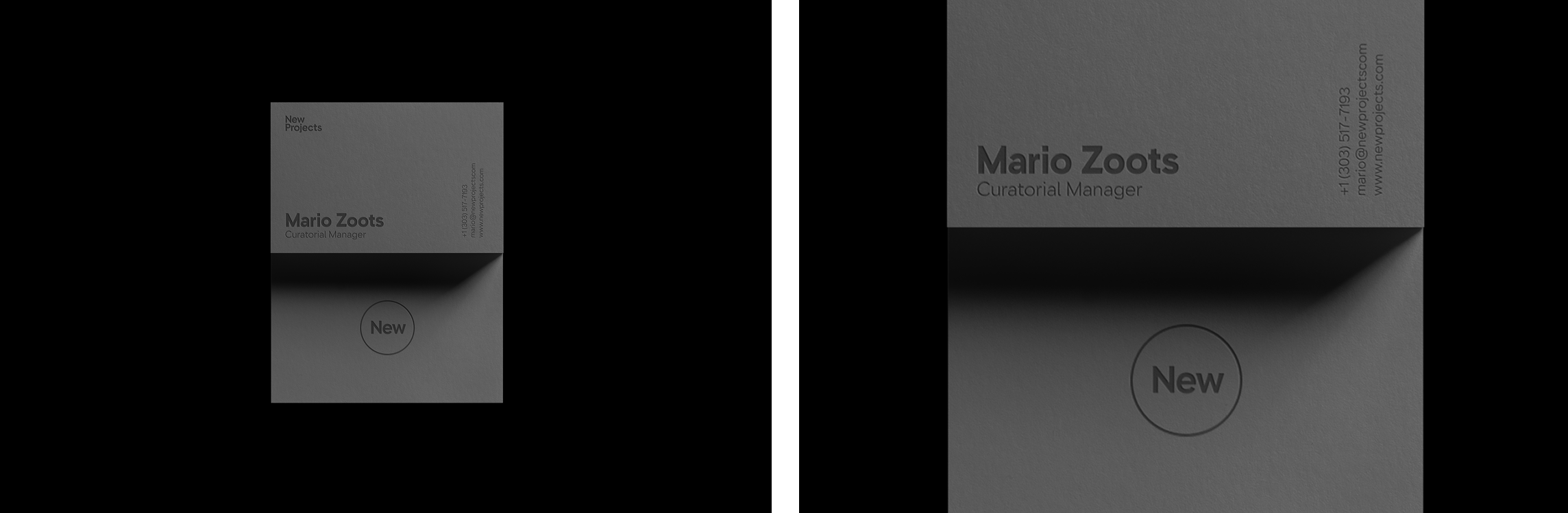
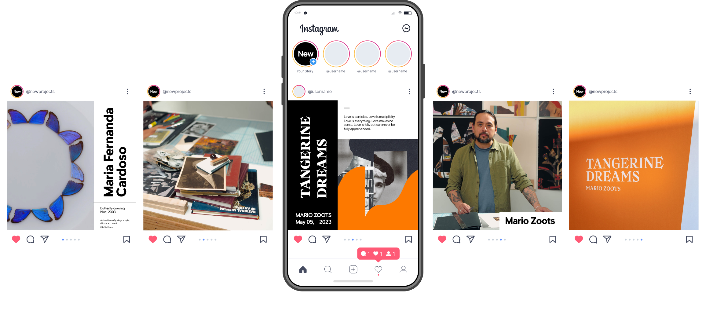
Across exhibition communications, social content, presentations, printed materials, and gallery touchpoints, the same principles create continuity without repetition. Each application can respond to its subject while remaining part of a recognizable New Projects world.
05 / SCALE
Built to change with what comes next.
As new artists, exhibitions, and programming enter the space, the identity provides a consistent framework without predetermining their expression. Its value is not in producing one fixed look, but in giving New Projects a visual language capable of continually accommodating something new.